5 Amazing & Detailed Client Briefs To Beef Up Your Brand Design Portfolio!
Most free online client briefs and prompts do not cut it. Finally, I created 5 that give you as much detail as real world project!
Creating realistic design projects for your portfolio is a must for finding higher paying work and applying to higher paying design positions.
You want to show off your visual design skills of course, but you also need to showcase your ability to work with client briefs, company values and desires and turn that into something that resonates with the brand and customers.
If you put a lot of effort into building very detailed case studies you may only need three or four really strong design projects to showcase on your portfolio to truly demonstrate your skills and ability to exceed expectations.
You will want to show your brainstorming process, color palette, any product or package design mockups, showing off brand language on ads or packaging, and you need to craft a presentation that pulls it all together that stays on brand.
There are tons of places to generate free client briefs and project prompts to get your creativity flowing and filling your portfolio with projects that emulate real world work. After trying most of them, I come away really disappointed. There is so much to creating a realistic design or branding project case study and most of these client briefs fall way short.
They include, at most, a paragraph about the company but not a lot of mention of client desires, wishes, brand language or ethos.
Some of them are great for helping you practice or generate a quick design project, but they lack the depth to create truly unique design projects.

A lot of these project brief generators are fun and give you a chance to break the blank page syndrome we often face as creators. The example above is from https://sharpen.design.

Here is another brief generator that gives you a very short prompt to work with.
This is from https://www.briefz.biz. A neat idea, but I come away with so many questions like:
What is the average rent for the apartments? Are we talking luxury or lower-end?
What city is this located in?
Who is your desired renter type for these apartments?
Where is the logo file or brand colors for these apartment complex?
These questions are all important parts of crafting a truly powerful portfolio project— and they are missing.

Good Brief does a better job by at least generating a paragraph of information on each brand design project. At least it defines the product and how it is special. I still have so many questions for this client, but the client is not real. How can I reach out and find answers? How can I really get the information I need to make it the best brand design portfolio piece ever?
You can even use Chat GPT, an artificial intelligence platform, to generate a client brief for you based on inputs, but I also felt like it lacked relatability and uniqueness in the types of companies it would ask for prompts for.
I am going to create 5 truly custom brand design prompts for you that are going to provide you with a rich dataset that seeks answers to all your questions.
Some will include moodboards, color palette suggestions, a brand ethos, mission statements, target market and a lot more! I want to create an experience of a real life client.
My suggestion is having anywhere from three to four super strong case studies for your portfolio. If you want to find out more about the brand design process and how to create a strong case study, you can check out my branding masterclass here.
I am going to be writing in the voice of the client. I will base these briefs on real world clients I have worked with in the past and each of the 5 different brand design prompts will each feature a different client voice, tone and situation.
Some of these clients will know exactly what they want and they make the process easy on you. Some clients have no clue what they want and may leave a lot up to you to decide. So, let’s do this!
Note: The goal of these design prompts is to help you build a really solid portfolio piece that uses close to real life company profiles and situations. Not all real world scenarios will have clients that provide you with such rich data and feedback. These examples are here to hopefully boost your portfolio to the next level so you can find increasingly better clients that value your process and provide stellar information to you. Also, this may give you some ideas about the kind of questions you want to ask your clients when the time comes.
#1. An energy drink called NewFuel
About the Client:
NewFuel is a non-caffeinated energy drink that derives its ingredients from natural energy boosting roots and herbs like Maca Root, Carob, and Ginseng and avoids using caffeine as its main energy booster.
We are tired of seeing so many caffeine based energy drinks. Caffeine can have horrible effects on sleep cycles, especially in teenagers who tend to drink popular sugary energy drinks. Our main goal is to provide clean energy sources using fun youthful visuals to encourage a younger demographic to drink heather energy boosting drinks with less sugar.
What do our drinks taste like?
We are going to launch with three main flavors:
Berry Booster - Light and juicy with blueberry and strawberry flavor notes.
Creamy Booster - Creamy and Savory with Coconut and Chocolate flavors.
Lightning Booster - A lighter limeade flavor that resembles a sport drink.
We also hope to continue to add flavors, so having a brand that can easily expand to other flavors and products will be productive.
Competition:
Our competition will mostly be other brands that also offer non-caffeine energy sources in the form of a drink. After doing significant research we feel we will be unique in targeting this sort of drink to a more youthful audience similar to one you might see with monster drinks.
MTE: They offer this in the form of a smaller “shot” but I see this targeting a more athletic audience.

Most other companies currently offering caffeine free energy drinks are targeting the more athletic or male audiences, while we will target both women and men who may or may not need to drink this drink for athletic purposes.
Target Audience:
As mentioned above, we hope to target a more gender neutral audience with neither male or female being dominant in our visual presentation. We also hope to skew lower on the age demographic, targeting mostly 18-29 year olds. We hope to capture those in their mid to late 20’s as previous monster energy drink consumers who wish to boost energy but without the harmful effects they experienced from caffeine. We also hope a more youthful, colorful visual experience will naturally attract those under 25 but older than 18.
Our target consumer will be health conscious and concerned about how caffeine has affected their sleep cycles and increased their anxiety. They want an energy drink that can get them through college classes or the first 10 years of their career, which may require a high level of energy and alertness. They tend to purchase organic fruits and veggies and are willing to spend a premium to know they are getting a safer cleaner product. They also may shop at Whole Foods and have extra disposable income due to their successful careers and work ethic. Our product price point will be slightly higher than an average energy drink.
Desired Color Palette:
We are very inspired from the pop art and post modern design styles of the past. We love how pop art features contrasting colors. We feel that would really resonate with our more youthful vibe and presentation. We also feel like bright vibrant color palettes will help lift ourselves off the store shelves and into consumers shopping carts.
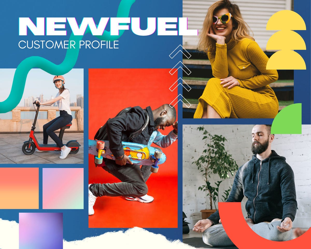
Examples of visuals we like:
I wanted to send you several visual examples of things we connect with. These are other brands and package designs we feel emulate that type of energy we are looking for. We have the unique position of also needing to portray a sense of being organic, healthy and natural. Stereotypically, you would see lots of leaves, trees and green things when you see an organic product, but we want to shy away from being predictable.
Yerbi
You can see the link above to the bechance project we found. We really enjoyed the color palette here and the pop art style visuals.

Engie
We really like the color palette here and the fact that they highlight the ingredients as a differentiator. We also like the poster modern pop art style illustration.

HISS
We like the artistic expressions with these. We do want to make sure we maintain readability of our name and products. That is one thing that I do not like about this presentation but I can appreciate the visual appeal of it.

We have to make sure we maintain a gender neutral visual presentation. A lot of energy drinks I see are very dark or use lots of black, which may turn off half our audience, females. I also want to make sure we do not go too feminine, either, alienating our male audience. This will be the trickiest thing about this brand design.
Brand language:
We will have an overall casual youthful vibe to our written copy and brand language. We have come up with a few phrases for our ads or products that help you see our brand language and ethos in action.
“Providing You With Fresh Energy Without The Crash”
“Fresh Energy That Fuels The Day”
“Caffeine Can Take a Hike”
“Nature’s Caffeine High”
“Caffeine Finally Dethroned”
“Add Calm to Your Energy”
Some words that I associate with our product:
Fresh Energy, Ultra Organic, Anti-Caffeine, Natural Energy.
Other things that will set our company and advertising a part from other energy drinks:
1.) We stay away from politics and sticky subjects in our ads. We focus on our product and its advantages as a safe natural caffeine alternative.
2.) We want to be cheeky and lighthearted in our brand language in hopes of standing out from the seriousness and over masculinity of sport energy drink messaging.
Deliverables and What We Need:
(note from Lindsay: approach this project how you want to, feel free to do all the items requested in the brief or just a few, I do not want this to be overwhelming but an enjoyable portfolio building experience for you and each project will require different deliverables.)
1.) We want to see a nice overall visual brand presentation.
Perhaps a brand board or stylescape.
2.) We would like to see some color palette options.
Color may be what we struggle with the most. We know we want bright, vibrant and fun, but want to make sure we choose our specific colors correctly to be as gender neutral as possible and not skew too feminine or masculine.
3.) We would like to see the new brand style presented on at least one can design.
We would ideally like to see a series of flavors represented in multiple can designs or colors (that would be bonus!) but we we also understand if we need to develop an overall direction first. We will let you (the expert) decide!
4.) If possible we would like to see a social media post introducing our product.
This can be for instagram, Facebook or any popular format or size. Almost 90 percent of our ad budget will be for social media ads.
We are looking forward to seeing what you come up with! Once you develop the deliverables we will sit down to review it in a zoom call meeting so you can have a chance to resent your brand design to us. From there we can finalize a color palette and start working more on the package design series and go from there.
#2. A Fintech company called GrowCulture
What is Fintech exactly? It stands for financial technology and it is any company that helps connect users to their money using technology solutions, usually in the form of a website or app. If you want to read more about the Fintech industry and what that means you can do so here.
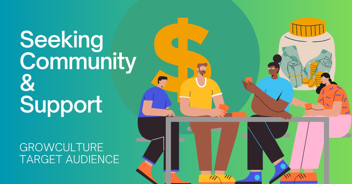
GrowCulture is a community based financial savings app for 20-40 somethings. It provides opportunities to not just learn about investing and saving in a social environment but also allows you to directly invest using the app.
That means we will be a broker/dealer that can buy and sell investments based on your risk tolerance. We have observed a dividing of two things in the investing world, community and investing. You either have strong social communities that talk about investing and saving money or you have businesses that can make that happen (bank accounts and investing accounts). There has not really been a product that merges the two in a convenient place.
We also want to empower young people to start saving and feeling confident in investing. There will be four main components to our app:
1.) Community and social spaces to empower and encourage.
There will be social media like forums and threads were users can talk about their savings goals and plans with others.
2.) Places to take action and invest and save.
There will be an area where you can buy specifics stocks, ETFs and other investment vehicles. There will also be an automatic savings features that allows you to save each day, week, or month extra savings from your bank account.
3.) Goal Meeting and Sharing.
The app will greatly reward and encourage goal setting. For example: Reaching your first $1,000 invested or paid off $4,000 in student loans. There will be entire social media threads dedicated to sharing those milestones and celebrating with users. There will also be monthly giveaways for those meeting these milestones that will feature encourage the use of the app.
4.) This is a culture, not just an app.
Culture defines who we are in our society. I want this app to do more than just connect people over money but to be a way we define ourselves as savers, growers and investors. This is more than just making and saving money but a place where we can be with others who share the same life goals, wishes and aspirations.
Competition:
When I first thought up the idea for combining community and finance I first thought of Robinhood. They provided an easy experience investing with an easy to use app that was targeted toward a younger audience. Their app almost feels like a video game when you buy and sell stocks. I liked the idea of making investing more gentle and enjoyable and less scary. I think what it lacks is the community aspect.
This is what will make us truly unique and unlike anything else the industry offers.
This could prove to be a challenge in the brand design efforts as there is not a lot to compare it to. There are online communities for saving and investing but they are so fragmented and spread wide over the internet.
Target Audience:
Main Target Age: 22-45
Target Audience Values:
They want investing and saving to be more than just an action they do. They want it to be a social activity that allows them to grow and feel confident about saving and investing. They want to give back to the community and participate on both sides of the social sphere.
They may already be active on social media and could even be more outspoken and post more than their peers.
There will also be separate areas for specific audience niches in the app. For example, there will be an investing social chat group in the app for women as well as those who love dogs or want to retire early. Users who reach a higher activity level on the app can even create their own social chat group in the app.
Those who will be most interested in the app may be those just getting started with saving and investing. It might be scary to them and they have avoided other companies that have a more traditional investing “look”. They also may not have a high net worth and may only have $100 to invest when first joining the app.
Desired Color Palette:
Traditionally blue and green have heavily been used in the saving and investing industries. We want to sidestep that and go in a slightly different direction with our app. We appreciate colors that are between the safety of blue and the green that is normally accepted with growth. I believe we need to have a blue-green color that does not go too blue or too green. I know we will need more than just one color and what that complimentary color is, I have no clue. I am leaving the design expert to that challenge. I am just a financial guy! But I do feel strongly about the blue-green color as least the main primary color.

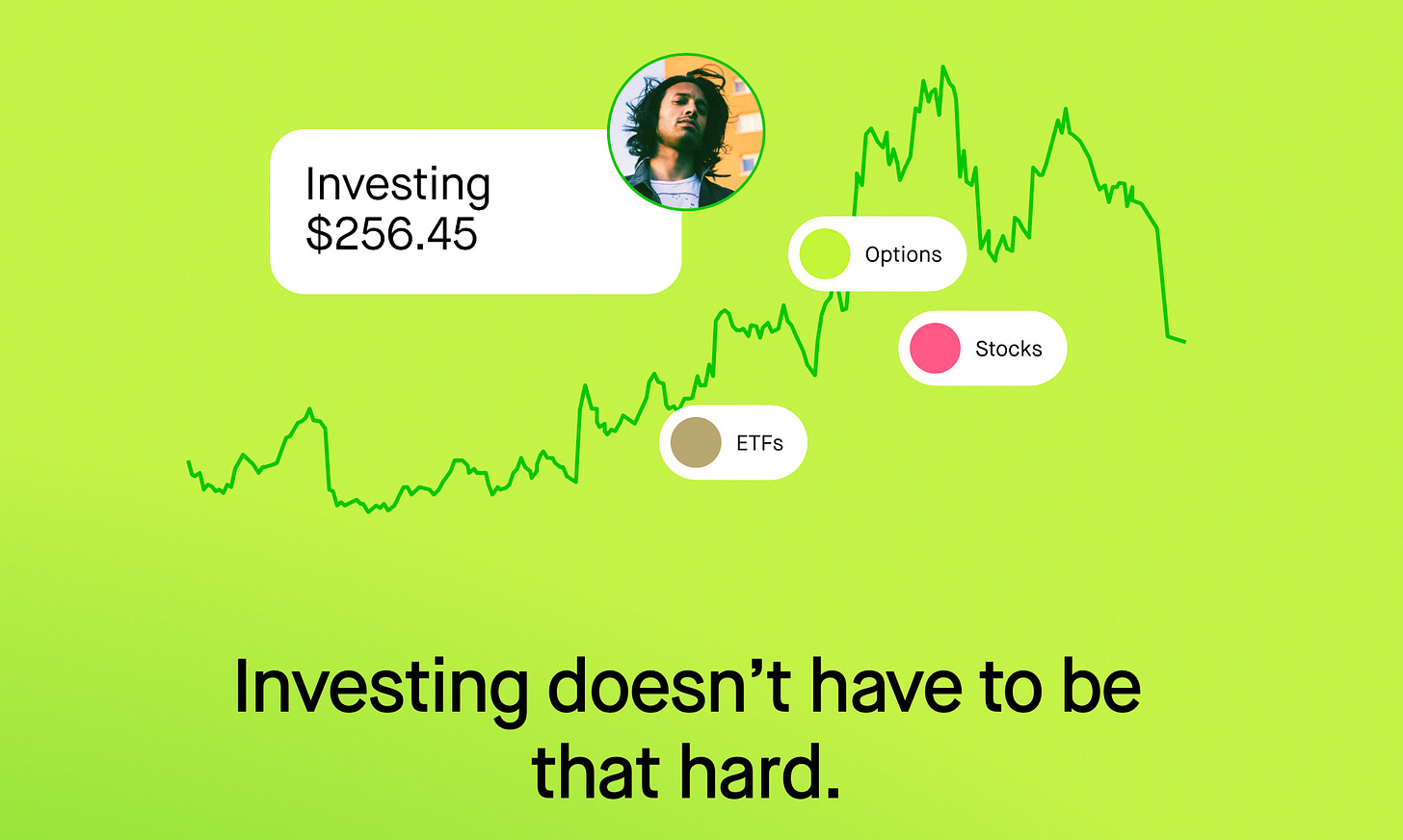
Examples of brands we like:
We are unique and nothing quite like our app currently exists, so I wanted to post a few projects that we like overall. Our team really has not decided what overall style we like best. We know some of these are really different from each other, but we just like the youthful vibes of them. Some have more of an illustrative style while others are more polished. We are hoping you can take our target audience information and business information and help really dig deep to find out what could connect with them the best with visuals.
Regardless, we want to show connection and community with most of our visuals.
Strive Bank
We liked the simplistic presentation of this. Clean text and simple illustrations.

Mkoba
We really liked the simple finger snap. The rounded edges gave it a nice approachable feeling.

Fintech Branding
Most financial apps have a really serious look so we wondered what it would be like to do something a bit unexpected and fun. We do want to avoid using too much black as most finical apps tend to use a total dark UI, which I find intimidating.

Brand language:
We want community and social connection to be more of our message than making money. We are still a money/savings/investing app, but we want to encourage people to invest based on feeling comfortable, educated and confident in their decisions and not to rush them to make our fees. We want our fair and user focused company ethos to also be seen in all of our brand communication and language.
“Community Over Cash”
“I am not the only one who gets scared by the buy button”
“Investing does not have to be a scary word”
“Milestones achieved with others feel more exciting”
“Investing is my dad’s word for making money, mine is GrowCulture”
Words we DO NOT want to use in our brand language:
Hard to use investing terms that are not explained in detail.
Deliverables and What We Need:
(note from Lindsay: approach this project how you want to, feel free to do all the items requested in the brief or just a few, I do not want this to be overwhelming but an enjoyable portfolio building experience for you and each project will require different deliverables.)
1.) Logo design.
We want to see some logo design ideas and some of the brainstorming process behind why you chose a specific text, symbol etc.
2.) We want to see a nice overall visual brand presentation.
Perhaps a brand board or stylescape. We want you to show off the brand design by presenting text, color palette, icons and any illustrations used for the brand.
3.) We would like to see one or two pages of our app design.
We are not looking for a full app design but are interested in seeing your brand design applied to at least two screens of our app. This could include our login screen, community area screen that shows our various groups or an investing screen. We want to see how icons, color palettes and text look all together in a smaller phone app format. If we like the brand presentation and how it looks on the app, we would eventually like to see that brand design applied to a full app design.
I am hoping to see something in the next three weeks. Our team is up against deadlines with our app developers as they will need some brand assets in the next month or two and I would really like to see all of this nailed down. Feel free to send us additional questions or early concepts so we can get this steered in the right direction quickly.
The next three client briefs are available to my premium monthly subscribers to my newsletter/substack. Thank you once again for your support!
#3. A retirement community called Mount Pinnacle Life Center
We are seeking out a designer to revamp our retirement community. We have existed for over 60 years and we are looking for a total brand refresh. We are also changing our name and need a brand design that will really help cater to new 55+ age group.
More about Pinnacle:
We are not just another retirement center. We like to call ourselves a “life” center as we believe some of the best years of life come in a twilight years. We are also unique in that our facility is deep in the mountains of Asheville, NC, a wonderful city full of social outlets, shopping, history and stunning views of the Appalachian mountain range.
Why is the word Pinnacle important in our name?
Pinnacle means two things here. This could be important in developing our brand or logo.
1.) Reaching your Pinnacle of life.
Reaching the pinnacle of life can happen at any age, it is all dependent on your attitude. Most residents will have grown children and are ready to start part two of their adventure. This is not the end but the start of the high point in life.
2.) Reaching the Pinnacle of the Mountain.
The textbook definition of pinnacle is “the most successful point; the culmination.” It can also be the top of a mountain in which our facility proudly rests.
Target Audience:
Our audience will skew much older than most brands you might have worked with. That does to mean our brand needs to look stale or traditional. Most of our future residents will be energetic and have a zest for life. They will live an active lifestyle and even take yoga or swimming classes at our facility.
They may enjoy hiking on miles of trails to soak in the beautiful mountain views. It is required to be at least 55 or older to apply to be a resident in our facility. Most marketing to future residences can happen as young as 50 as we have a multiple year waiting list.
Desired Color Palette and Colors to Avoid:
We are drawn to hopeful uplifting colors like gold and purples but we are open to color exploration. We also have the beautiful backdrop of the Appalachian mountains to consider, perhaps we can go to photos for color inspiration? Sorry we are not too helpful here as it can go many directions. I do want to stick with a few rich deep saturated colors to make sure our brand still resonates with our target audience. I want to avoid neon colors of course!
The Look We Like:
We want to balance between a traditional “trusted” feeling of a long established institution with a more uplifting, brighter look that gives the viewer hope and excitement about this next phase in their life. Here are some brand designs we saw that I feel our team really connected with.

Pinnacle Financial
They happen to have the same name as us (Although they are in a different industry) but that is not what attracted us to this brand design. We like how it is both bold but also uses traditional typography and just feels really clean overall.
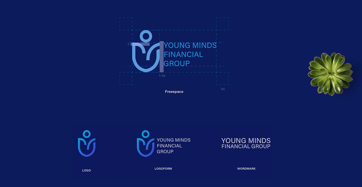
Young Minds Financial Group
We also liked the simplicity of this one. We also love the imagery here. We are not feeling deep blues, as we feel that lacks the energy we are wanting to give off, but we do like the overall layout and typography.
The idea of using a mountain top or some sort of symbols of a mountain is really appealing to us based on our unique location.
The Appalachian mountains are an older mountain range and have more rounded mountain tops, as opposed to sharper tops of newer mountains ranges (like the Rocky Mountains). We want to make sure whatever symbol that is developed, it matches the qualities of the Appalachian mountain range. We also are open to combining it with something else like a sun setting.
Brand language:
We are a retirement center, but most of our brand language will discourage the use of the word “retirement” in favor of “life” and “peak moments”. We want to maintain a sense of respect, dignity and a renewed zest for life in all of our commutations with potential residents.
“Life’s peak is just beginning here at Pinnacle.”
Deliverables and What We Need:
(note from Lindsay: approach this project how you want to, feel free to do all the items requested in the brief or just a few, I do not want this to be overwhelming but an enjoyable portfolio building experience for you and each project will require different deliverables.)
1.) Logo design.
We want to see some logo design ideas and some of the brainstorming process behind why you chose a specific text, symbol etc.
2.) A brochure or handout (flyer).
Because our audience is older we are focusing most of our marketing budget on traditional print items. We would like to see a brochure or a flyer (handout) so we can see how the new brand refresh looks on printed materials.
Our remodeling and name change will take several months to complete. There is no rush on developing new brand look and assets. We hope once we establish a brand look that we can use you for all of our print and digital needs. We are also looking to add this brand style to a new website. We would like to see the new brand refresh presented to us (the board) in at least a month timeframe. Let me know if that works for you!
#4. A Personal Brand for a Motivational Speaker - Daniel Woods
My name is Daniel Woods and I am a motivational speaker and my full-time job is traveling around to business and personal development conferences to do keynote talks, break-out sessions and lead retreats. I am in the self-help genre and my main idea is encourage people to self motivate.
I am looking to develop a professional brand to help me land larger conferences and be able to increase my speaking fee. I also need more consistent brand recognition for my book and future books I plan to publish. I want it to look polished and high-end with consistent brand elements.
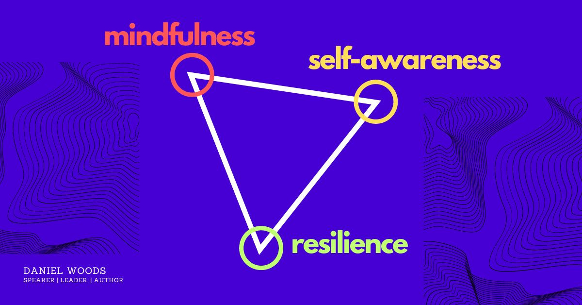
My book, talks and break-out sessions all center around self motivating through three main pillars: mindfulness, self-awareness and resilience.
Mindfulness
The first pillar is Mindfulness and it is a practice that involves being fully present and aware of the current moment. When you practice mindfulness, you become more attuned to your thoughts, emotions, and bodily sensations. This awareness can help you identify the root cause of any negative or unproductive thoughts and behaviors that may be holding you back. By recognizing these patterns, you can begin to change them and adopt more positive habits that align with your goals. Mindfulness can also help you stay focused and resilient in the face of challenges, as you learn to acknowledge difficult emotions and then let them go. Overall, mindfulness is a powerful tool for developing the self-awareness and clarity needed to stay motivated and achieve your goals.
Self-awareness
The second pillar is the ability to recognize and understand one's own thoughts, emotions, and behaviors. It can help motivate you by providing you with a clear understanding of your strengths, weaknesses, and values. When you have a strong sense of self-awareness, you are more likely to have a clear vision of what you want to achieve, which can serve as a powerful motivator. Additionally, self-awareness can help you identify any negative or unproductive thought patterns or behaviors that may be holding you back. By recognizing these patterns, you can work to change them and adopt more positive habits that align with your goals. Overall, cultivating self-awareness is an essential tool for staying motivated and achieving your goals.
Resilience
Lastly, the third pillar is Resilience and that is the ability to adapt and bounce back from adversity, setbacks, or challenges. When you are resilient, you are better able to handle stress, uncertainty, and setbacks, which can help you stay focused and motivated towards your goals. Additionally, resilience can help you develop a growth mindset, where you view challenges as opportunities for learning and growth rather than insurmountable obstacles. By adopting a growth mindset, you can stay motivated and continue to push yourself towards your goals, even in the face of setbacks or failures. Overall, resilience is a powerful tool for staying motivated and achieving your goals, as it allows you to approach challenges with a positive attitude and a determination to succeed.
My thoughts on my personal brand:
I really feel like those three main pillars are important to the personal brand. I would like to see that represented somehow even if it is showing three of something to symbolize those pillars.
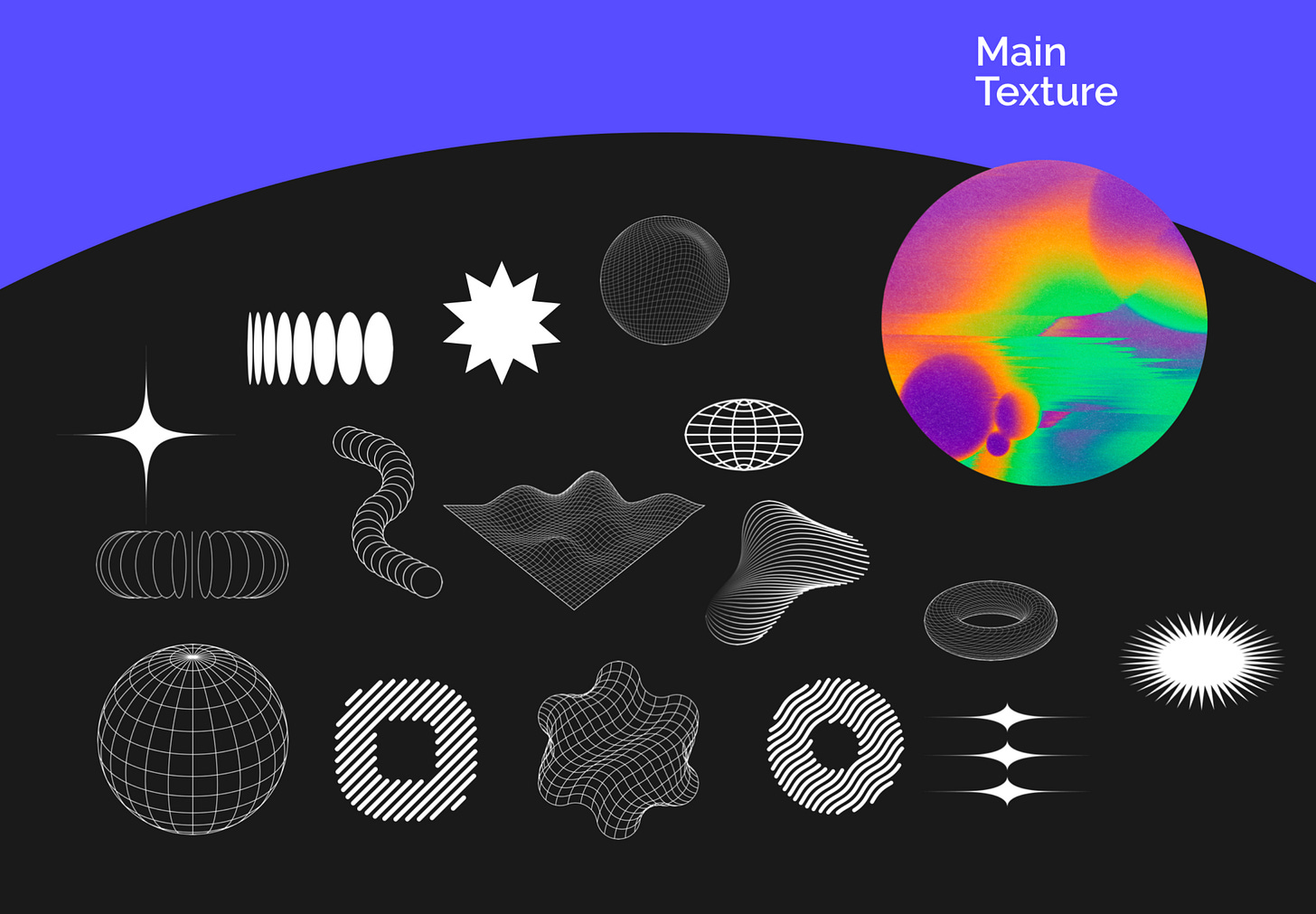
I have always been drawn to these types of geometric shapes below. I am not sure what you would call these, line art? I liked how simple these little shapes were to illustrate complex ideas. I really feel like my logo, symbols and other brand assets are simple and easy to understand.
Colors:
I want to avoid black and white, although I am open to dark gray. I want to use saturated bold colors to stand out. I also want to avoid using red, I feel like it does not provide a soft, approachable feel and can be associated with negativity and loss.
Other brands I like:
I wanted to show you some examples of personal brands I gravitate toward when I think of my own brand.
I like the simplicity of this personal brand and also the use of geometric shapes.
Personal Branding Gabriel Marcondes
I like this brand a lot. If you click on the link above you can see how adaptable this logo is. I really enjoy the rounded version of the logo too. I do not like the lack of color and feel I want more saturated colors.
I enjoy the font used for the name on this one. I also like how simple it is as well. Once again, I feel like I do not want to use too much black.
This is the most recent bio my copyrighter forwarded to me and one I feel like could be helpful in the development of my personal brand.
Daniel Woods is a highly sought-after motivational speaker, life strategist, and author. With over 15 years of experience in the personal development industry, Daniel has empowered thousands of people to achieve their goals and live their best lives.
Daniel's approach to life strategy is based on the principles of mindfulness, resilience, and self-awareness. Through his speaking engagements, workshops, and coaching programs, he helps individuals and organizations transform their mindset, overcome obstacles, and achieve their full potential.
As a published author, Daniel Woods has written several books on personal growth and development, including “Self Motivation is Here”, which has been praised by readers and critics alike. His insights and advice have been featured in major media outlets, such as [Media Outlet], [Media Outlet], and [Media Outlet].
Daniel has worked with a diverse range of clients, including Fortune 500 companies, non-profit organizations, and educational institutions. His clients appreciate his practical approach, engaging style, and ability to connect with people from all walks of life.
Whether he is delivering a keynote address, leading a workshop, or coaching one-on-one, Daniel is committed to helping people achieve their goals and live their best lives. His passion, expertise, and charisma make him an inspiring and impactful speaker who is sure to leave a lasting impression on any audience.
Deliverables and What We Need:
(note from Lindsay: approach this project how you want to, feel free to do all the items requested in the brief or just a few, I do not want this to be overwhelming but an enjoyable portfolio building experience for you and each project will require different deliverables.)
1.) Logo design.
We want to see some logo design ideas and some of the brainstorming process behind why you chose a specific text, symbol etc. I am interested to see how you incorporate my three main pillars into my logo/symbol/brand. The logo needs to include the following:
My name: Daniel Woods
My tagline: Motivational Speaker & Author
2.) A business card.
I need a business card that will really “wow” when I hand it out to event promoters. It does not have to be in a traditional size either. Business cards are still a big deal in my industry and I really want you to put a lot of effort into this one, perhaps show me multiple ideas. I need to have the following on my business card:
My name: Daniel Woods
My tagline: Motivational Speaker & Author
My three pillars mentioned: Mindfulness, Self-awareness and Resilience
My number: (555) 555-5555
My website: DanielMotivates.com
My Instagram: DanielMotivates
3.) Letterhead.
I also send out a lot of official communication, invoices etc. through the mail. I would like to see a custom envelope, letterhead and possible invoice with my new brand design on it.
4.) Mugs, T-shirts and pens.
Most of my income comes from speaking at events. I usually hand out hundreds of promotional items with my brand on it and would like to see some that are popular at business conferences.
I hope I was able to provide you what you needed to get started. I have a huge event I am the keynote speaker for this summer (in three months) and would love to launch my new personal brand by then including having some hand-outs ready. If you have any question feel free to ask me!
#5. A new concept for a donut cupcake food truck called DoughCakes
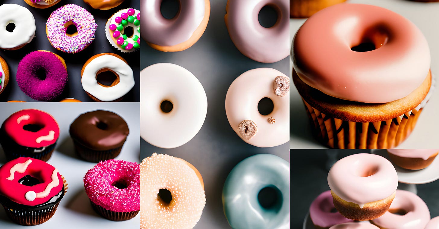
Have you ever heard of donuts of top of cupcakes? Well we are a first-of-its-kind food truck that will offer various types of fun styled donuts on top of cupcakes.
We will offer lots of fun flavors and most of donuts and cupcakes come with lots of color, pizzaz and all that jazz!
We are a brand new company and hope to launch multiple food trucks in the our local area in the next few months. Our eventual goal is to sell this as a franchise opportunity so our new brand design has to be on point!
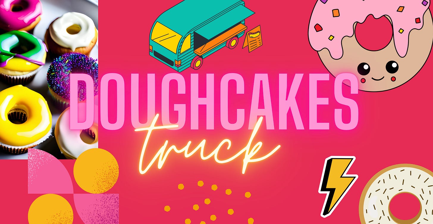
Our style is very loud, youthful and retro. We really like some of the typography featured here in the image above we created using graphics in Canva. We like the look of the 80’s but we do not have to be 100% retro. Some keywords of the style we like are sketchbook, neon and Lisa Frank.
We want to create a series of fun icons, sticker like illustrations for the truck. We want to print larger adhesive stickers that can easily be removed on our truck and swap out designs on our different trucks to spice it up from time to time. We want our brand to be so distinct no matter what icons, illustrations or stickers we use people will know right away it is a DoughCake truck!
Color palette:
We are pretty set on making at least one of the primary colors pink as some of our signature toppings and sprinkles will be a variety of hot pink colors. In the food industry it is widely known that red can boost appetite, so we are open to the use of red too. No matter what we want a very full easy to use color palette. We love all the colors!
Examples of other things we like:
We love bright and vibrant food truck designs and hope to also see our logo design come along with a food truck design so we can see them at the same time.
Some examples of some brands we like are as follows:
We love the colors used here and how they are used. We also like how they have a whole icon set for their brand.
We want to be a little bit messy with our brand. Not messy as in hard to look at but not so clean it is boring. I feel this look is youthful and really connects with our generation (Gen Z). We also like how the stickers can be applied to packaging etc.
We just are obsessed with the style of these stickers. We feel it really captures our vibe and energy.
Geometric abstract shapes. Memphis
These patterns and shapes are gorge! Really liking the overall feeling with this project. Make sure to click on the link to see the whole thing.
Brand Voice and Language:
This is interesting because we are still trying to figure ourselves out. We know some words and phrases that really help to describe who we want to be with our business.
Fun Energy
Everything deserves sprinkles!
Donuts have been missing their beds
Keep your cupcakes warm with donuts!
Donuts & Cupcakes the dream is real!
We are going to have similar phrases on our napkins, plates, truck and cups.
Deliverables - What we need!
Our hope is to get started on a truck design so we can get the graphics to the truck wrap person soon. I think we have a good month to flesh out the overall look and feel of the brand so rush but not a big rush.
1.) Logo Design and Truck Wrap.
We need to get an overall design of our food truck. This can be a wrap, or a wrap + stickers we can place on there.
2.) Napkins, cups, plates and food paper.
We will want to start off with some branded items that will go in our food truck. The food paper is the parchment or baking paper that will wrap the cupcake in and place in a cupcake cardboard box holder. We are still not 100% on exactly the packaging we use to hand out the cupcakes, but we know we will need to basics, napkins, plates and cups etc.
3.) Icon or Sticker set
Once we establish the overall brand look we are going to want a series of icons or stickers we can use to place on all of our brand items, cups, plates, and the truck itself. We want the icon set to look like a theme together.
Thanks for being so willing to hop on board with this brand design! We look forward to seeing your initial ideas and thrilled we hired you for the job!
Make sure to check out these massive discounts on both my PDF design theory book HERE and my many graphic design courses here!
I am hoping to grow this list and include more brand design prompts and projects.
I hope you enjoyed the five included above and let me know what other type of resources and help you would like to see as subscribers!
Student work so far!
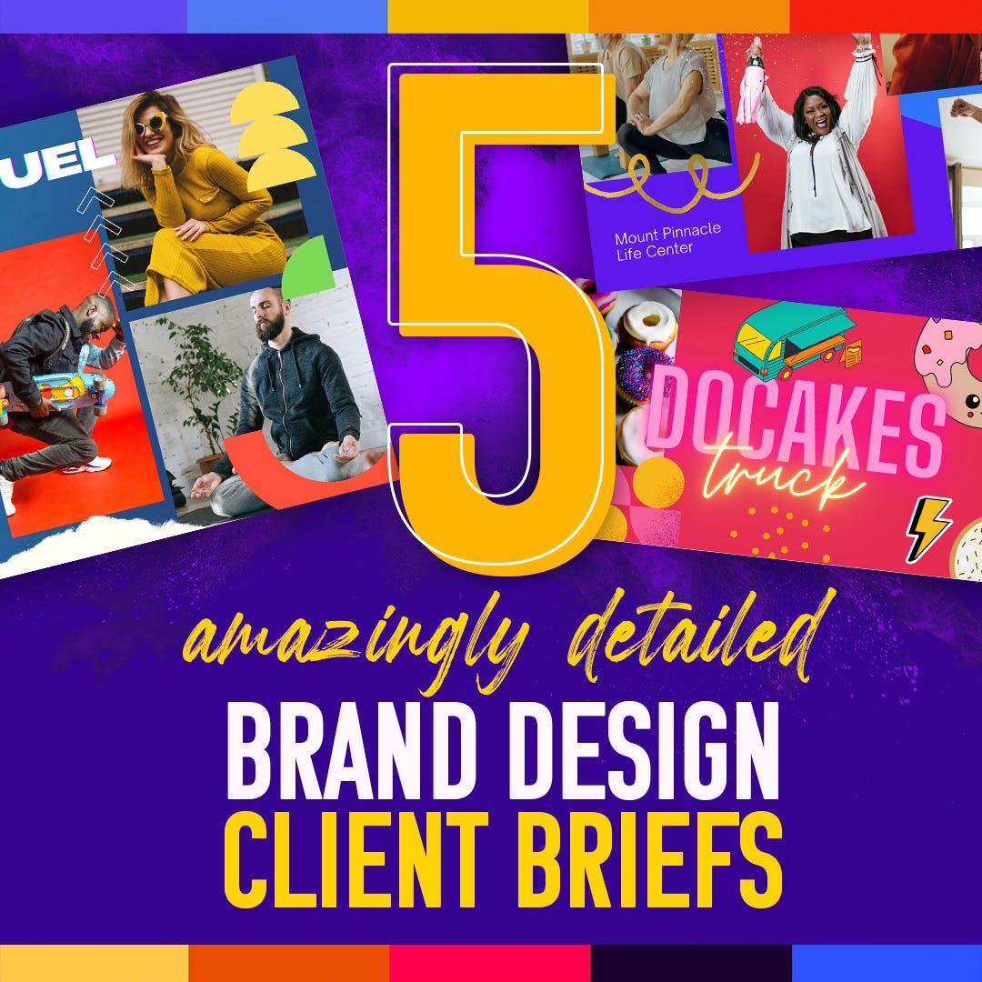
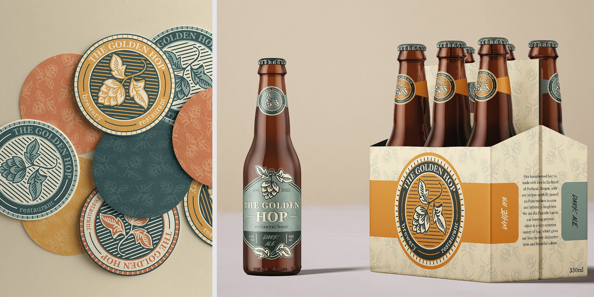
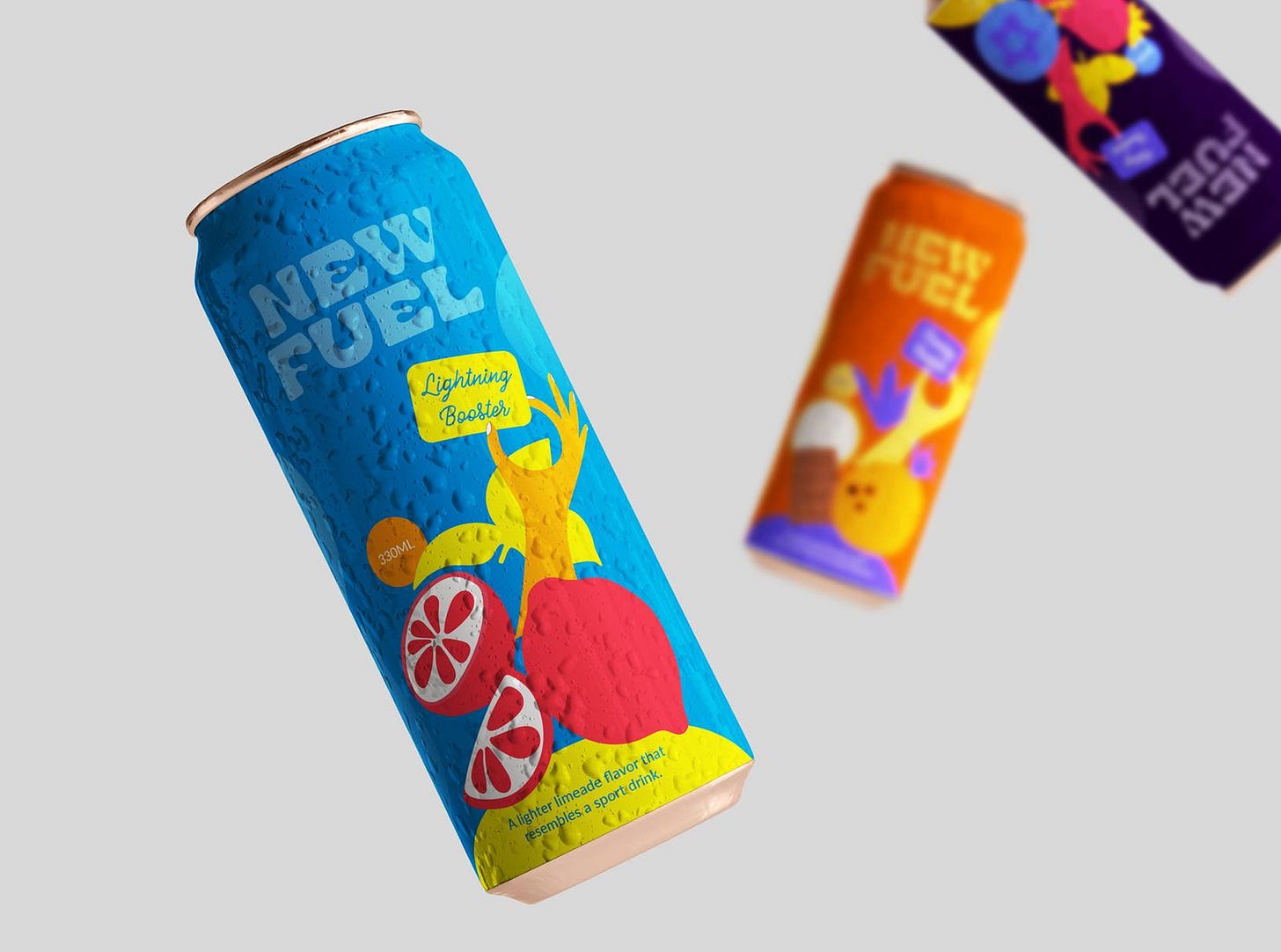
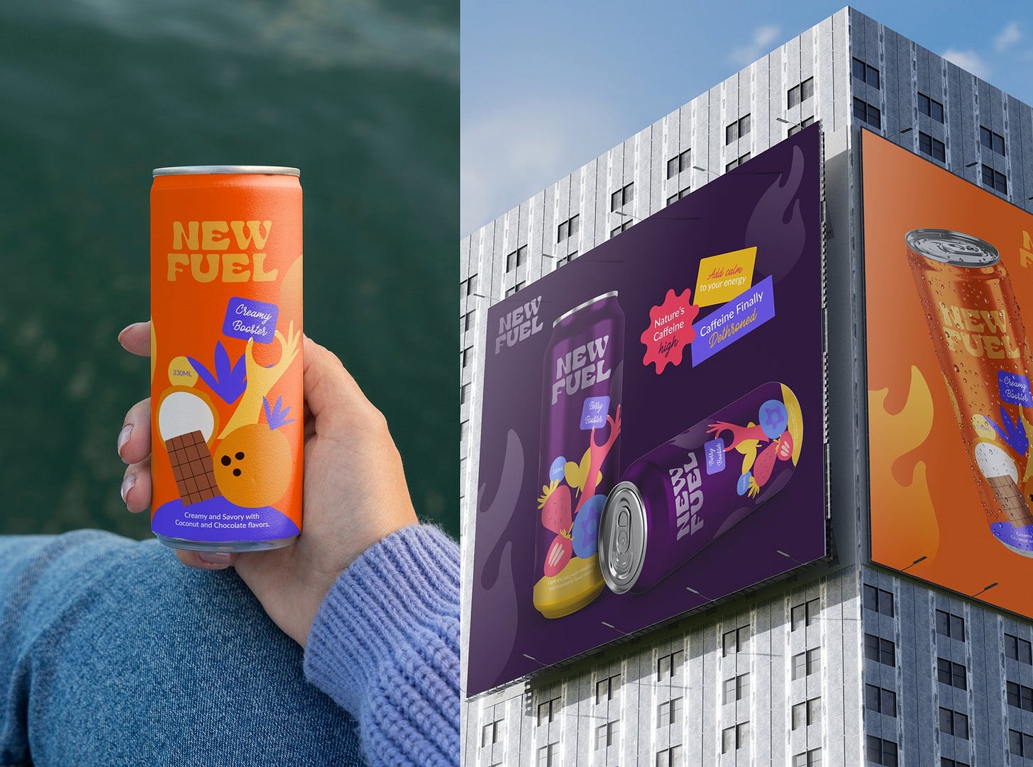
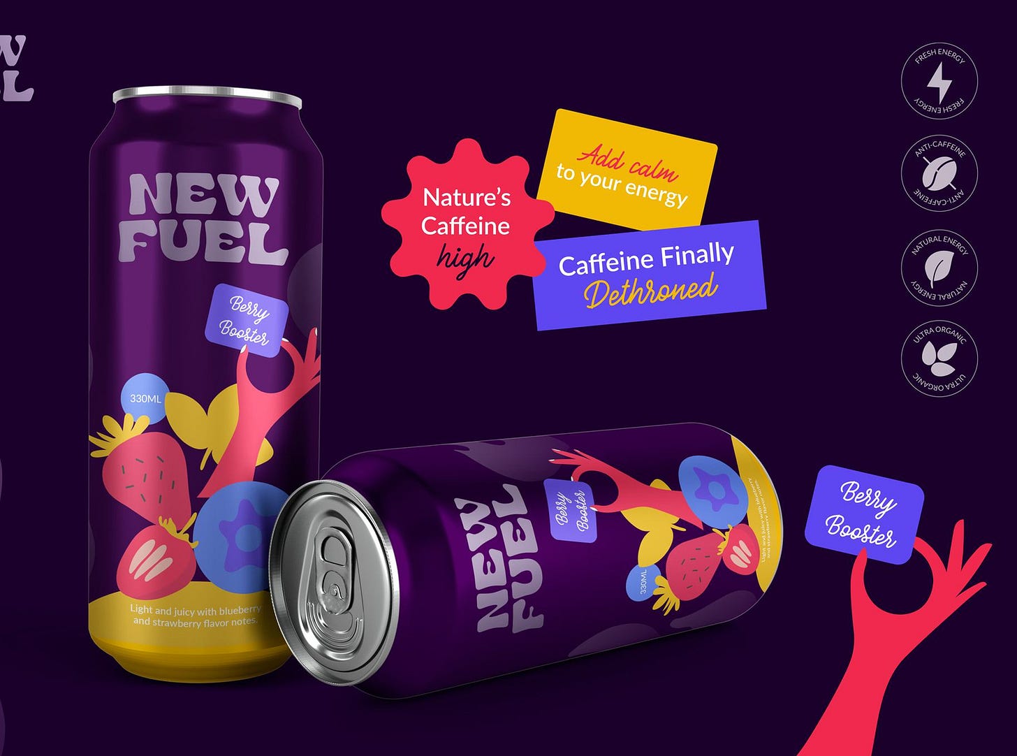
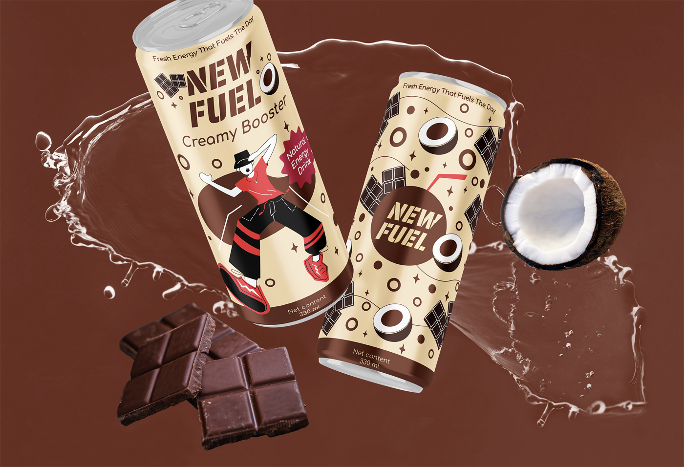
Sometimes seeing someone else’s interpretation of the brand can give us a bit more confidence in trying our own. Here are some student work so far. I will add here as I receive ones I feel really did well interpreting the client briefs.

















Let me know of any questions below!!!
Hi Lindsay,
How do I go about requesting "client feedback" from you on the briefs? I have a client portal set up through Notion to keep communication, documents, and resources centrally located for ongoing projects. Ideally, I'd love to be able to treat this brief as if I were using the workflow I'm developing for real clients.