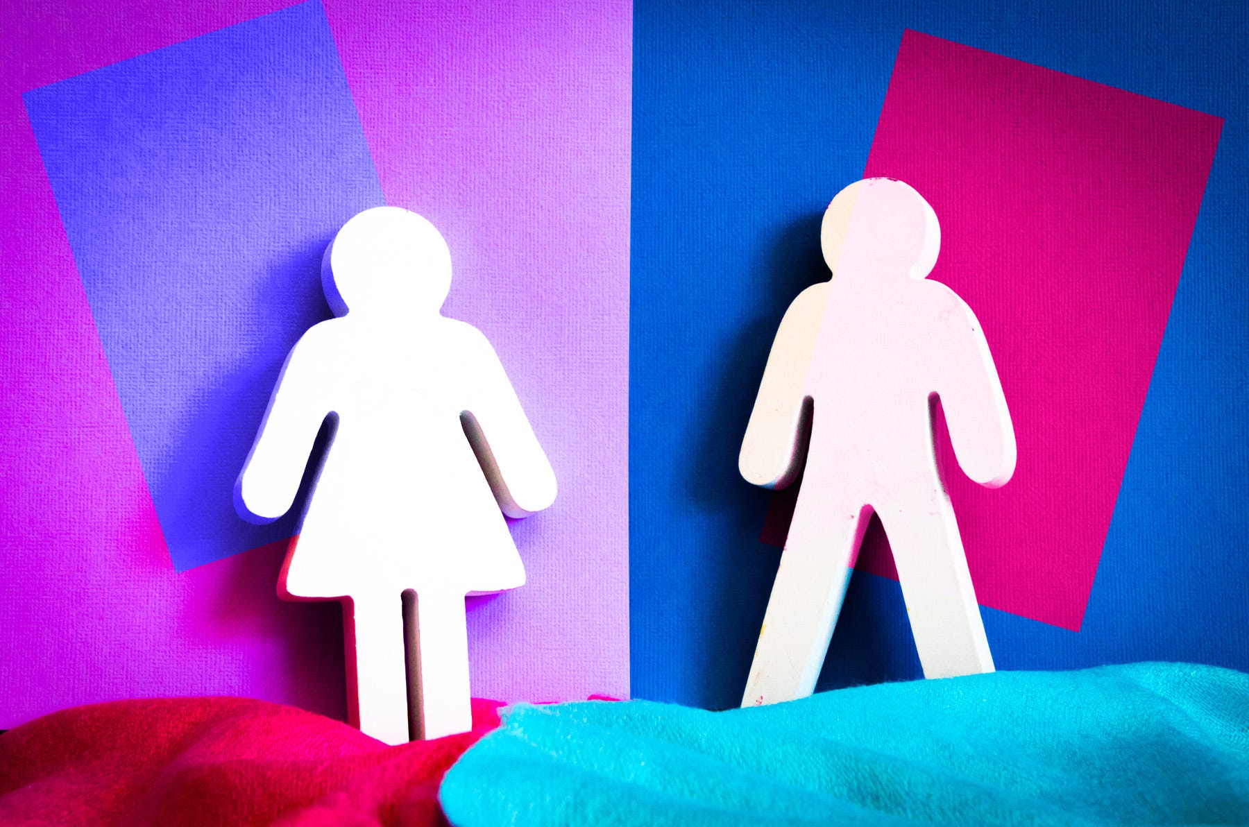
As graphic designers our main goal is to communicate messages in the most effective way possible and connect with the viewer. If we find out our audience is mostly male, how do we design to appeal to a male dominated audience? More importantly, if I identify as the opposite gender or a neutral or non-specific gender, how can I design for that audience? This article will address several relevant items:
1.) How do I define what is traditionally feminine and masculine design? We look at some interesting studies and research into the matter.
2.) We will study the history of gender stereotypes in design.
3.) How can I base my design decisions on marketing and psychology research instead of gender assumptions I may have grown up with?
4.) How can I design for my own gender, plus other genders, and still have relevance?
5.) How do I learn the importance of gender-neutral design when marketing to a gender-diverse audience?
6.) How to ensure my portfolio is targeting my chosen audience and balances traditionally feminine & masculine case studies with gender-diverse case studies.
Are you ready? Here we go!
This article is available to ALL subscribers for free! If you are not subscribed to my e-mail newsletter please do so below!
**Another Side Note: I am not going to be political with this article as I know it will be easy to do so with such a hot topic of gender. I want to focus on research, design theory and facts on how to create effective branding for all genders.**
Historically, design aesthetics have been categorized into two distinct, gendered styles: feminine and masculine.
Feminine design has often been associated with soft colors, flowing lines, and delicate details, while masculine design typically incorporates dark colors, strong lines, and robust materials.
These stereotypes have persisted for generations, influencing our perceptions of what is suitable for different genders. However, it's crucial to acknowledge that these stereotypes are limiting and do not accurately represent the diversity of preferences and identities that exist today.
Preferences in design are highly subjective and vary from person to person.
It’s important to remember that gender identity is a complex and multifaceted aspect of oneself, and doesn’t necessarily dictate design preferences. While there are many individuals who prefer design that is more traditionally aligned with their own gender, many others do not! For example, some men may enjoy pastel colors and floral patterns; some women may appreciate darker colors and industrial styles; and gender-diverse individuals may prefer traditionally-gendered aesthetics. Design can accommodate everyone’s preferences, and does not have to be linked to gender identity.
Take a look at these two typeface choices above. For the font on the left, would you say it is traditionally masculine or feminine in its appearance?
It’s safe to assume that 99 out of 100 of you will most likely say feminine. But why? It is a standard script font with a handwritten thick marker tip appearance with loops on the “L”s and “G”s. What about the one on the right? It’s more associated as masculine, right? Buy why? It is a thicker, chunky font with a small outline to give it a layered appearance. It is tightly condensed and the stroke thickness is very consistent giving it a strong vibe.
What about these two typefaces?
They are not very different from each other and they both feature sans-serif letterforms with less distinct characteristics. These gender neutral typefaces are pretty flexible and rarely get tangled up with gender specific associations.
But, what if I were to add color?
The two posters below both feature a gender neutral Helvetica but using different colored background. Which one would you say feels more masculine? Feminine?
By just adding stereotypically feminine and masculine colors, I can make a poster appear to cater or appeal to one specific gender.
That is what makes this so interesting as pink was not always a color associated with being feminine.
Pink’s mother color is red. If we look at the psychology of colors, red tends to exude more masculine properties like aggression, strength and energy and from that standpoint it makes a more fitting match, as opposed to blue.
When children’s clothing was being mass produced, manufacturers were interested in color coding clothes for different genders in hopes to increase sales. Some clothing stores like Macy’s color coded Blue for boy and Pink for girls while other department stores claimed the opposite.
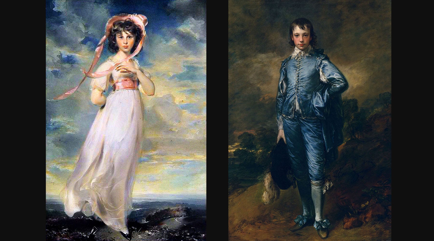
It was not until a millionaire named Henry Huntington purchased two 18th century paintings, "The Blue Boy" by Thomas Gainsborough and "Pinkie" by Sir Thomas Lawrence, that society’s propensity to declare pink for girls and blue for boys really took off. You can read more about this story here.
This was a big purchase by Henry Huntington at the time, the 1920’s, so pictures of the paintings were displayed in many prominent newspapers. The girl, who was 11 at the time of this painting, wore an elegant pink dress while the boy wore all navy blue. Because of the rising popularity of these paintings a gender stereotype was born.
Could two paintings from the 18th century have determined the color of clothes you or I wore as a child in the 20th and 21st centuries? It’s amazing, the power of just a few paintings and the manufacturers desire to color code clothes by gender to increase sales.
Fortunately, this stereotype is slowly breaking, but it will take time for a century-old assumption to totally disappear. Many men now wear pink and it has become somewhat of a fashion trend.
What does this all mean for my color choices in my designs? Pink may be breaking new gender bending ground for men in the fashion world, but what about branding?
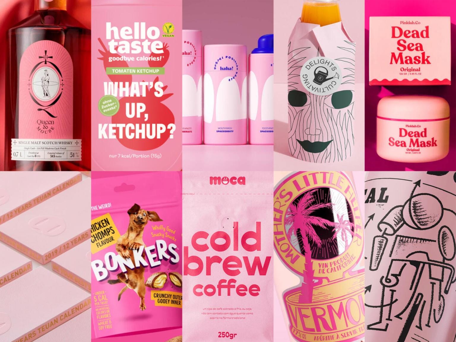
Many feminine brands where the target market is mostly female, or gender fluid, still rely on heavy uses of pink to show off their products gender preferences.
From female gendered personal products, to make-up lines it is easy to see the gender preferences of color when marketing to the female gender. As a mother to a 7 year old girl, every time I go down the “girls” isle of the toy store the only color I do see in prominence is pink. And think about how other aspects of society reinforce the color pink as associated with the female gender. You can’t hardly go anywhere without seeing the Susan G. Komen Breast Cancer Foundation’s ubiquitous pink sticker on cars, T-shirts and banners.
What if brands decided to use colors not based on gender bias but on color psychology and research?
Designers who create brand designs for male or female gendered products and services need not to rely on the past for color influence and choices. I read a lot of research on color preferences in marketing and here are some interesting results.
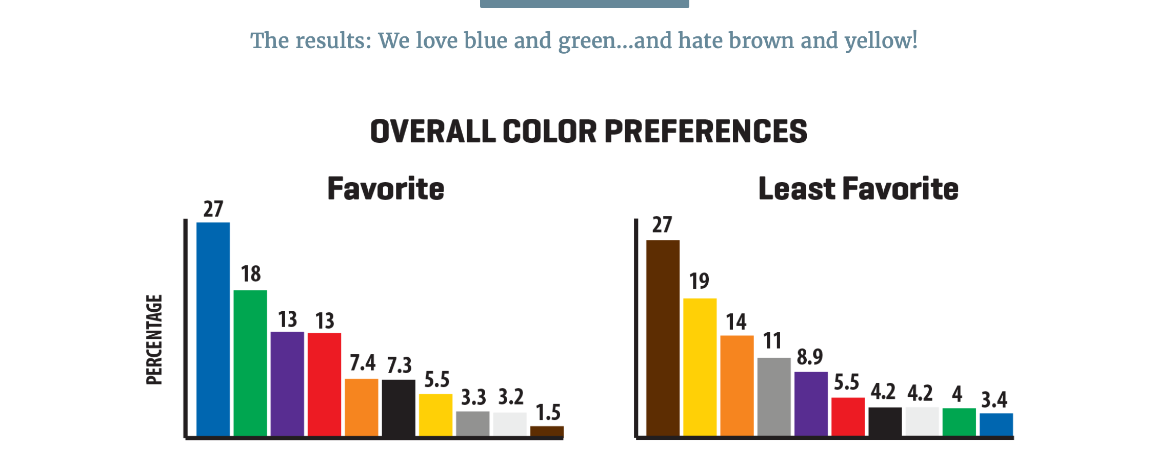
What you are seeing below is a graphic taken from a really interesting 6,000 person survey on color preferences. As you can see from the chart, cooler colors dominate while warmer colors are second and neutral colors are in dead last.
It is no surprise that there is a low preference for yellow. It is such a powerful energetic color that it can easily overwhelm. Brown, on the other hand, is natural and organic, yet ranks number one for the least favorite color preference.
Brown is one of the toughest colors to pair with other hues, mostly because brown is made up of so many other colors and tends to favor warmer tones. Some of the least favored color combinations involve brown!
Unfortunately for this study, they did not include pink, which would have been nice to see it ranked. But other studies rank pink much lower than blues, greens and purples. Of course all this can change depending on the region of the world you are gather data from, so each survey done will vary slightly in its results.
The most interesting piece of data here was that BOTH male and female gendered surveyors had blue and green as the top two preferred colors with the only difference being that red is slightly more favorited by men than by women.
Does this mean that men and women are more-or-less the same in terms of color preference than we once thought?
Another study by the University of Winnipeg research document quoted,
“There are differences in the perception of colors between genders. Khouw (2002) found that men were more tolerant of gray, white or black than women, and that women reacted to the combinations of red and blue more frequently, and got confused and distracted more than men. It was also found that the combination of red and blue was the most preferred color by adults. These results suggest that there are gender differences in the perception of color. True, the subject’s impressions of color seemed to be more subtle and effected not just by the coolness or warmness of the color palette, but also by the calibration of value, chroma, and contrast used in the interiors (Khouw, 2002).“
This study found that the combination of both Red and Blue was favored by both genders and that black was more tolerable by men than women.
Perhaps how we digest and perceive colors needs to be something to consider when creating brands for either-or genders and everyone in-between.
”For instance, 85% of shoppers say that color is their primary reason for buying a product. And 66% of people won’t buy a product unless it comes in their preferred color.” Quote from here.
Ok, so those are just color preferences. What colors actually helps sell a product?
According to this research study when participants were around highly saturated, vivid red and yellow environments they showed a measurable increase in heart rate. There are also research studies in which the color red has been linked to an increase of appetite and blue to a decrease in appetite.
Research is amazing when trying to figure out the perfect color palette.
Some of the most effective brands span larger color palette ranges that satisfy the psychology of marketing and make the product more distinguishable among others.
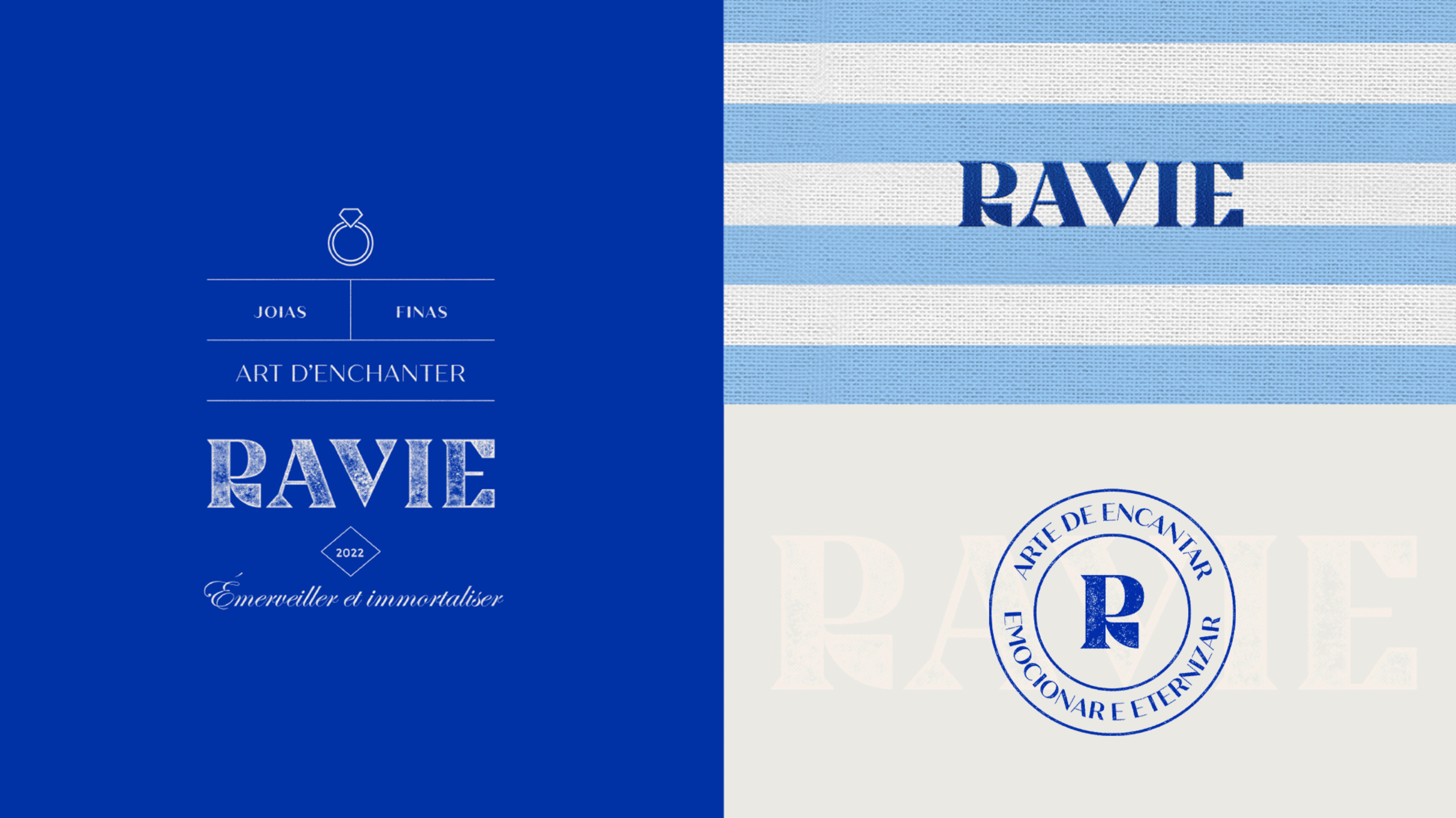
This gender-bending jewelry brand uses a bold navy color throughout and a nice, custom gender neutral typography. Although mostly targeting women, it did not have to fall back on traditional ideas of femininity, yet it retains a very appealing look for all.
Let’s talk a bit about typography. We touched on this a little bit above, but I want to dive in deeper.
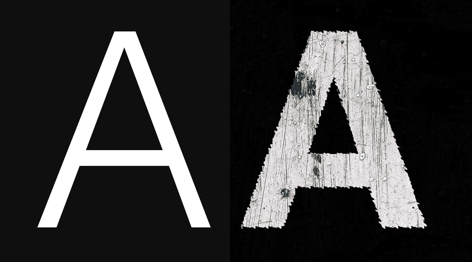
Take a look at these two letterforms.
They are using the same font choice but one is more charred, distorted and “grunge”. Which ones appears more masculine? “The distorted one, of course, because men love worn and rugged things and women like dainty curly smooth things!”
No, silly me, I am stereotyping like I was taught to when growing up in this gender separating society.
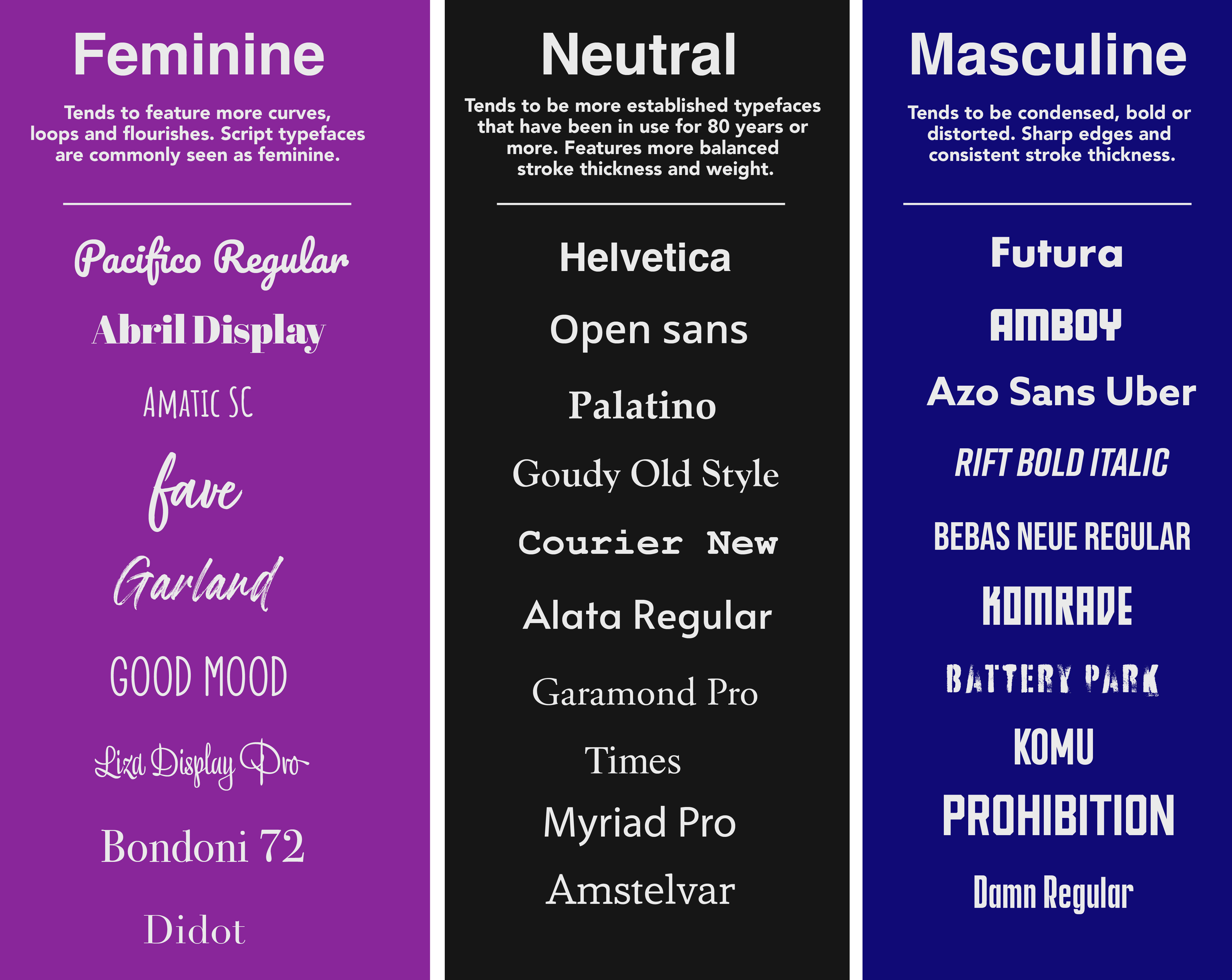
I wanted to push my natural tendency to stereotype by gender by doing an experiment. After being in design for over 20+ years, I decided to categorize some popular typefaces into a feminine, masculine and neutral categories.
I found this exercise very enlightening. There were times when it was hard to determine if a typeface should go into the neutral or into the masculine area. I found it much easier to define feminine fonts as they tended to be more decorative, ornamental and distinct.
I noticed that the neutral typefaces I chose were mostly established typefaces that have been around the longest. The masculine category included tons of tightly packed condensed typefaces that only had an all caps option. Some had distorted features but they all had a strong bold appearance.
This is a very subjective exercise. Many of you might shift a particular typeface into another column.
I suggest you guys do a similar exercise to see your observational bias on typeface distinctions in regard to feminine vs. masculine design.
To understand why we (and I) might make some of these assumptions, let’s talk about the history of typefaces and how that might have shaped our bias.
Typefaces, the visual embodiment of written language, have evolved over centuries reflecting cultural, technological, and aesthetic shifts.
The concepts of "feminine" and "masculine" design in typefaces, while not universally agreed upon, have played a role in shaping typography.
Early Typographic Influences (15th - 18th Century)
The history of typography began with the Gutenberg Press in the 15th century. Early typefaces, often referred to as "Old Style" or "Humanist," were inspired by handwritten scripts of the time. These typefaces featured lowercase letters with varied stroke thickness, flowing lines, and serifs resembling calligraphic strokes. These characteristics are sometimes associated with "feminine" design due to their organic and gentle appearance.
A page from the Gutenberg Bible
However, it's crucial to remember that typography in this era was primarily utilitarian, aiming for legibility and aesthetics of handwritten manuscripts. Concepts of gender-specific design were not a primary consideration. Today, you might think of this detailed script typeface as more traditionally feminine as opposed to masculine, when at the time it was neither and was considered functional.
Transitional and Modern Styles (18th - 20th Century)
During the 18th century, the "Transitional" style emerged, characterized by increased contrast between thick and thin strokes and more geometric shapes. This style transitioned into the "Modern" or "Didone" typefaces of the 19th century, featuring high contrast, vertical stress, and a more mechanical appearance. These developments are often associated with "masculine" design due to their precision and formality.
Two pages from Bodoni's Manuale Tipografico, a posthumous showcase of his work and engraving by his wife.
The 20th century brought further typographic evolution with the "Sans-serif" typefaces like Helvetica, which have minimalist, clean lines. While some may consider sans-serif fonts as having "masculine" traits for their simplicity and straightforwardness, they are widely used across various contexts, and their gender associations are not definitive.
A of public institutions and governments use Helvetica as their typeface of choice.
Contemporary Typography (Late 20th Century - Present)
The late 20th century and the digital age witnessed an explosion of typeface designs. Modern technology allowed for greater experimentation, leading to a wide array of fonts catering to diverse preferences. Typefaces like Baskerville and Bodoni continue to be associated with classic elegance and formality.
On the other hand, script fonts, with their cursive, handwritten style, are sometimes considered "feminine" due to their fluidity and decorative nature.
In the 19th century, script typefaces gained popularity and underwent various stylistic changes. Copperplate script, for example (featured below), became fashionable in the United States during this period.
These scripts were often used for formal documents, invitations, and decorative purposes. The curvaceous and ornate nature of these typefaces contributed to their association with elegance and refinement, traits that were often linked to femininity in the societal context of the time.
I find this so interesting because today this would be considered very traditionally feminine in nature. One hundred years ago this script style would be considered more formal and elegant not necessary just for the female gender to use but also for men high in political office. To find out why there was a change in gender association lets go back in time once more into this history of script typefaces.
So why are script typefaces associated with femininity? The Victorian Era and the Feminine Ideal.
The Victorian era (19th century) was characterized by strict gender roles and ideals of femininity that emphasized gentility, decorum, and refinement. Script typefaces, with their intricate, flowing lines and decorative elements, became associated with the Victorian feminine ideal.
They were frequently used in personal correspondence, invitations, and other materials related to the domestic sphere, reinforcing the connection between script fonts and femininity.
This historical connection between beautiful penmanship and femininity has persisted.
Decorative and Ornamental Elements: Many script typefaces incorporate decorative and ornamental elements such as swashes, flourishes, and ligatures. These embellishments can be reminiscent of the decorative arts traditionally associated with women, such as embroidery and lacework. As a result, script fonts can evoke feelings of adornment and femininity.
In advertising and branding, script typefaces have frequently been chosen to appeal to markets or products associated with femininity. For instance, script fonts are commonly used in cosmetics, fashion, and wedding-related branding to create an aura of elegance and beauty. This practice has further cemented the connection between script typefaces and femininity. Here are some other reasons why we tend to see female gender stereotypes on popular household products:
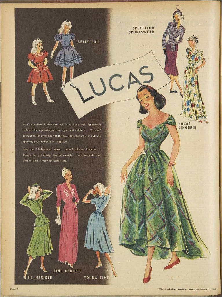
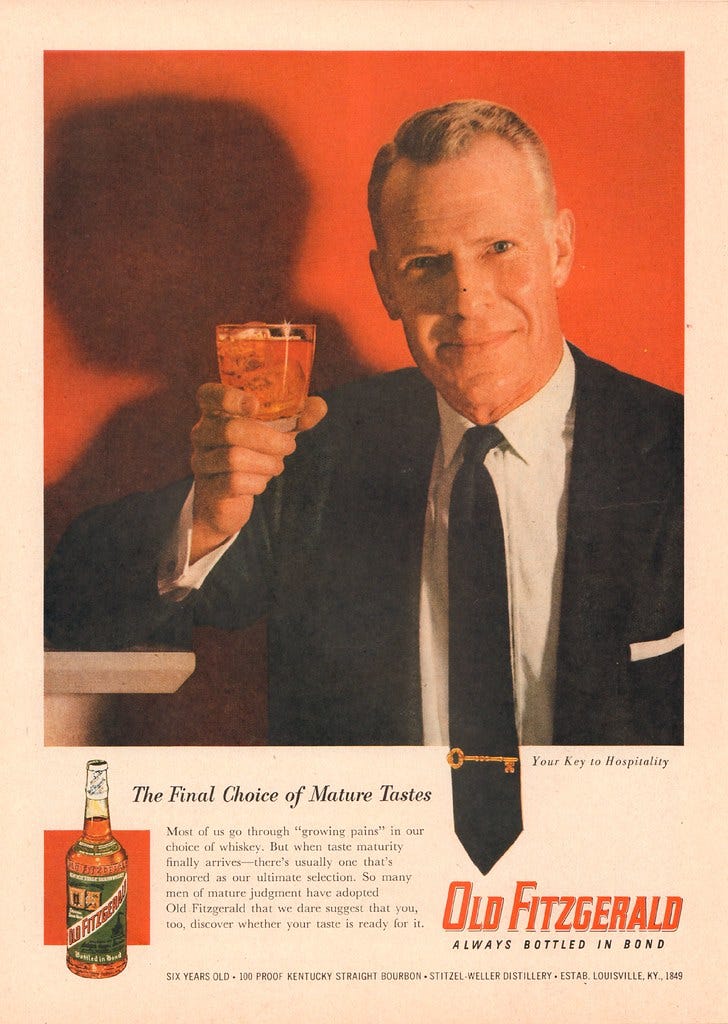
Traditional Gender Roles: Many advertisements have historically depicted men and women in stereotypical gender roles. For example, women are often portrayed as caregivers, homemakers, or primarily concerned with their appearance, while men are portrayed as breadwinners, leaders, or focused on physical prowess. These stereotypes reinforce traditional gender norms and roles. This of course is changing, but one hundred years of portraying limited gender roles still takes hold of our subconscious bias.
Limited Representation: Advertising has frequently presented a limited and idealized version of gender. Women, in particular, have been portrayed as young, thin, and conventionally attractive, while men are often depicted as muscular and assertive. You can see this aspect in my typography exercise I did above. Stronger more condensed typefaces were put in the masculine column while more delicate slender-lined typefaces are put into the feminine category.
Product Categorization: Products have historically been categorized as "for women" or "for men" based on arbitrary gender associations. For example, cleaning products are often marketed to women, while power tools are marketed to men. This reinforces the notion that certain products and activities are gender-specific and can limit opportunities and choices.
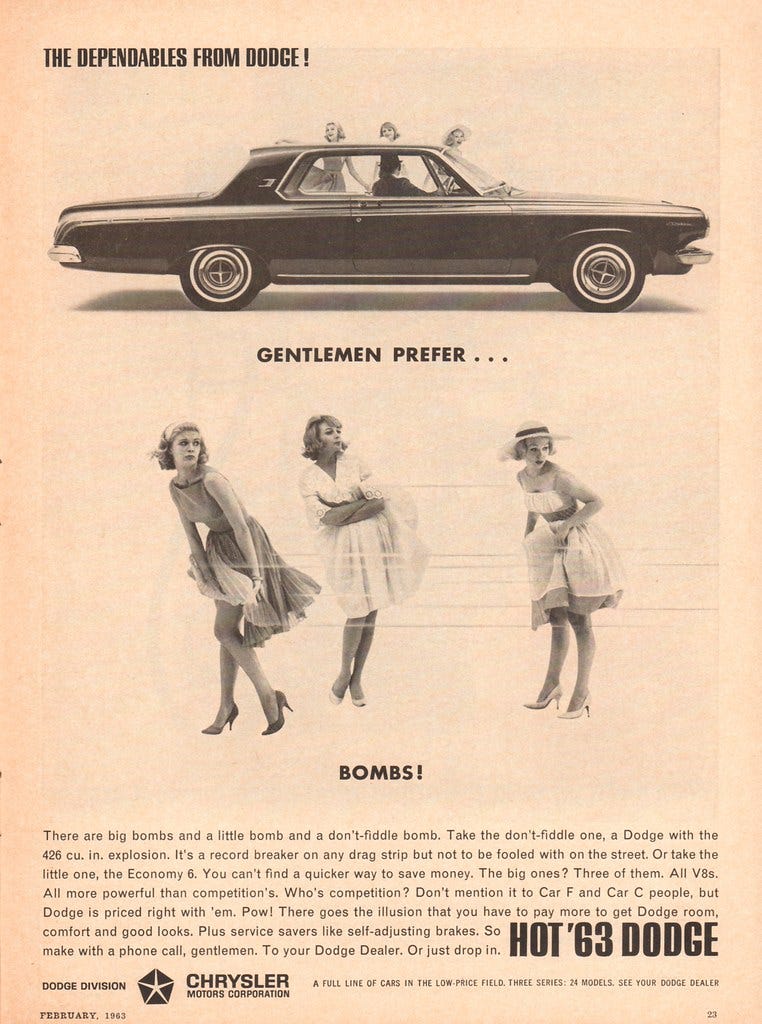
For larger purchases, like a car for example, the ads were mostly geared toward men.
In the mid 20th century men were the majority breadwinners and the male gender traditionally made larger household purchases while women made smaller ones. This bias showed up many times when researching older advertising photos. Do you notice the san-serif condensed typefaces used here?
Now that we understand a bit of the history of gender bias in design we can now talk about creating more neutral design that resonates with your target market. This can be a tough topic because although we all want to be gender neutral in our design process we carry hundreds of years of stereotypical bias from our culture. This makes it difficult as designers but also for those approving your designs and your target audience themselves as they too may still carry bias with them.
Gender-neutral graphic design is a design approach that aims to be inclusive and accommodating of all gender identities and expressions. It seeks to avoid reinforcing traditional gender stereotypes and creates visual content that is accessible and appealing to a diverse range of individuals. Later, we will get to review a few really good examples of gender neutral design I found on Behance.
A few things to keep in mind when creating gender neutral design.
Understand Your Audience's Diversity: Begin by gaining a deep understanding of your target audience's diversity. Recognize that gender is just one aspect of a person's identity, and individuals may have varied gender identities and expressions. Conduct thorough research and surveys, if possible, to learn about your audience's demographics, values, preferences, and attitudes related to gender and inclusivity.
Use Inclusive Language: In your copywriting and messaging, opt for inclusive language that doesn't assume or prescribe gender roles or identities. Avoid using gendered pronouns (e.g., "he" or "she") and opt for gender-neutral terms like "they/them" when appropriate. Encourage diverse perspectives and experiences in your content.
Visual Representation: Consider the visuals you use in your design. Represent a diverse range of genders, ethnicities, abilities, and body types in your images and illustrations. Ensure that your visuals do not reinforce stereotypes or traditional gender roles. Aim to create visuals that reflect the real world and the diversity of your audience.
Color Palette: Be mindful of the color palette you choose. While certain colors have been traditionally associated with gender, challenge these stereotypes by using a broad and diverse color palette. Avoid overly gendered color schemes, and select colors that resonate with your brand's message and the emotions you want to evoke.
Typography and Design Elements: Select typography and design elements that are neutral and versatile. Avoid fonts or design elements that may be seen as overly feminine or masculine unless there is a distinct design purpose for them. Script typefaces, for instance, can be used sparingly and thoughtfully, rather than relying on them exclusively. The same can go for rugged distorted typefaces.
Test and Gather Feedback: Conduct usability testing and gather feedback from members of your target audience who represent diverse gender identities and backgrounds. This feedback can help you identify any unintentional biases or exclusions in your design and advertising.
Collaborate with Diverse Teams: Building a diverse and inclusive team can be invaluable in creating gender-neutral design and advertising. Collaborate with individuals from different backgrounds and perspectives to ensure that your designs are sensitive to a wide range of experiences. As a woman, I may want to establish a community that consists of different genders and associations and not just stay in community with other female designers.
Stay Informed and Adapt: Gender and societal norms are evolving, so it's essential to stay informed about current conversations and changes in language and culture. Be prepared to adapt your design and advertising strategies to reflect evolving norms and preferences.
Portfolio Mistakes: Avoiding a balanced approach.
If you have a personal brand as a designer, consider how your branding materials, portfolio, and social media presence reflect your commitment to gender-neutral design.
I see, far too often, students who create a portfolio that is overwhelming feminine or masculine. I know that some of this is a designer expressing their own creative love for particular design element or style, so it is not all bad. You may really love pink and script typography and that is ok! But what you need to be able to do is show a balance in your case studies and work.
The illustration by Daria Verna (above) is a really good example of showing their femininity with balance. Yes, they use pink but the illustrations show off their talent to design in a multitude of ways. Gender neutral design should not be a stripping of your personality but the ability to show it off in different ways.
You need to be careful not to pigeon hole yourself into one particular bias. Your hyper masculine or hyper feminine design could be off putting to a variety of audiences. “Girl Boss” design in the 2010’s is a showcase of this in action.
What works best is showing a variety of design styles that shows your breath as a designer.
I have personally got to work with several brands that have a majority male audience and landed that client due to presenting a wider variety of project styles.
I think now is a good time to showcase some really good gender neutral or balanced design projects from Behance.
A pizza place for all.
This balanced design does not isolate any one gender and can be appealing to all. It has a harsher custom typeface paired with lighter sketched illustrations showing its diversity in design approach.
This is one of those situations where the audience is most likely 100 percent male audience. As much as I would love to know what having a beard is like I may never know that sensation as a women. Even though this is targeted toward one specific gender I still think it avoids the stereotypical male design pattern. First of all, it uses a lighter cobalt blue instead of darker blue or just pure black. It also features a really detailed and ornamental illustration one usually sees on more feminine products. This adds a natural organic softness to it while also maintaining that it is for a male audience.
Gender neutral design does not mean you have to abandon specific colors like pink or script typography or distorted text. It just means a more awareness and consideration for the avoidance of traditional stereotypes in design.
This is a fine example of putting the functionality of a design to the forefront with smart packing design. This simple brand relies less on color and typography and allows it to be unbiased. You can view the whole project here.
Where Illustrations shine.
Stunning illustrations shine on this beer brand. Although there are some illustrations that might be more delicate than others, as a set they stand fairly neutral appealing to all who appreciate good beer.
This personal brand design by Juan Leite is a masterclass in gender neutral design. They have a very wide varied color palette with a fun playful text. You can still show off your personality and still be neutral.
In conclusion, creating gender-neutral design and advertising requires a thoughtful and empathetic approach.
By understanding and respecting the diversity of your target audience and actively challenging stereotypes, you can create messaging that is inclusive, respectful, and appealing to a wide range of individuals, regardless of their gender identity or expression.
In recent years, discussions about gender-neutral and inclusive design have expanded beyond typography. Designers are increasingly conscious of avoiding stereotypes and embracing the diversity of gender identities. Typography, as a fundamental element of design, is no exception.
I encourage you to select typefaces based on their appropriateness for the project. Inclusive design principles promote the idea that typography should be accessible, legible, and appealing to everyone, regardless of gender identity or expression.
Gender-neutral design is not merely a trend but a reflection of our collective commitment to recognizing the diverse spectrum of gender identities and expressions. It reminds us that design is not confined to binary constraints, but rather, it is an art form that celebrates the beautifully complex mosaic of human experience.
As designers, we have the privilege and responsibility to shape visual culture, influence perceptions, and contribute to a more inclusive society. By championing gender-neutral design principles, we not only create spaces, products, and messages that resonate with all individuals, regardless of their gender identity, but we also pave the way for a more respectful world—one where everyone's story is valued, celebrated, and beautifully expressed through design.
I hope you got a lot out of this article and learned a thing or too about the history of design styles.
Let me know below what you think of this topic but also post a link to any gender neutral design you feel needs to be recognized. I will be happy to add it to my examples!


Make sure to check out my pdf design theory book and design courses on my website here! https://lindsaymarsh.myportfolio.com
Just hanging out here in the comments! Looking forward to having a discussion about the matter.