The Starter Guide to Building the Ultimate Portfolio!
We walk through the entire process in detail using examples, tips, tricks and a system to work through to craft a portfolio that lands you work in the creative space.
What I find most creatives struggle with is knowing how to create a portfolio that helps land them jobs, clients, work or increases their prospects.
There are so many questions like:
What portfolio builder do I use?
Do I need a website based portfolio, or a pdf one?
Do I need to have my own domain name and hosted website or is a third party website ok, like Behance?
What type attracts the most prospects?
How personal do I get on my portfolio?
How expressive or stylistic do I get with my portfolio?
How do I handle the contact area and bio portion of my portfolio?
Do I include a photo or bio in my portfolio?
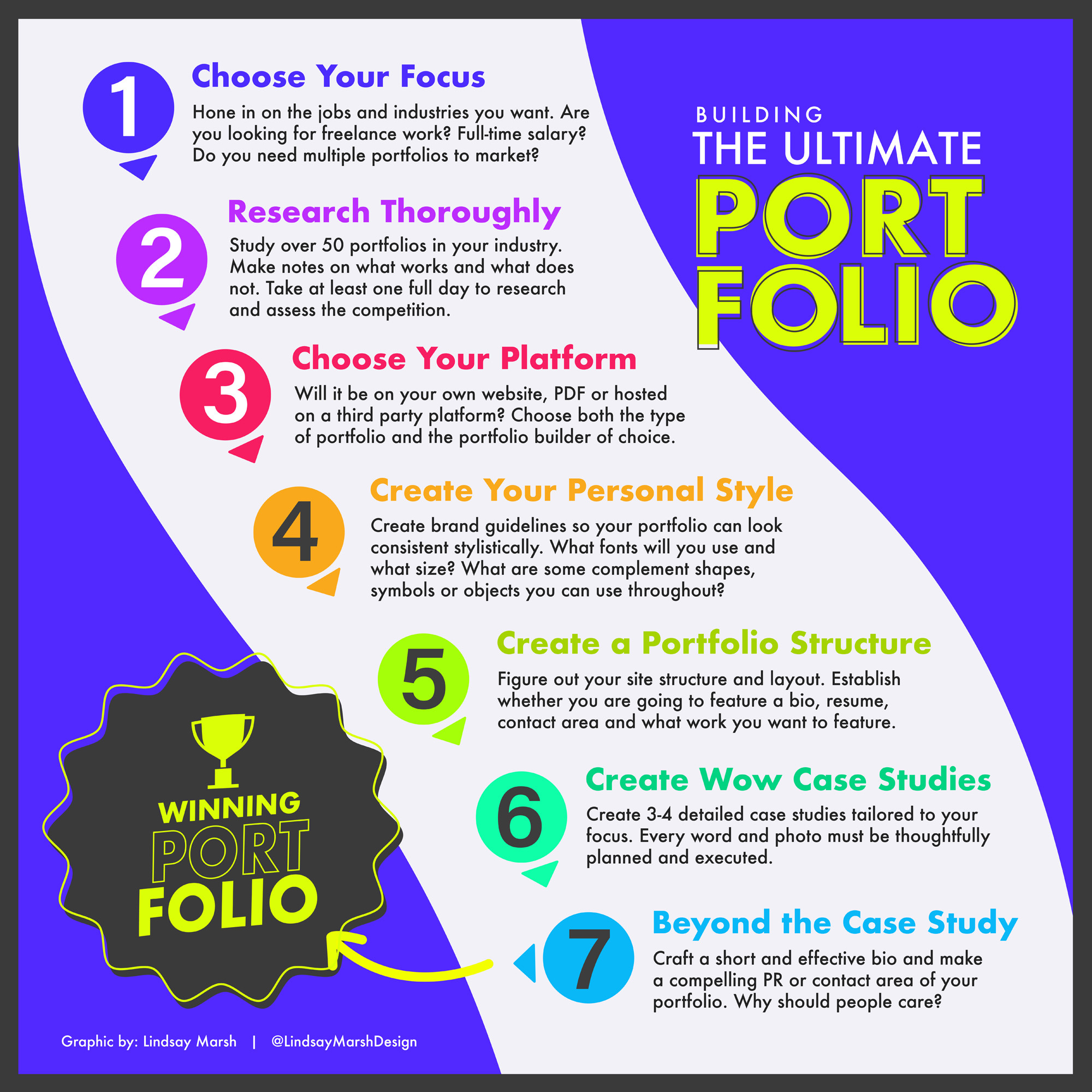
Fortunately for you, I created a 7 step process of portfolio building which more than answers these questions.
In this article, we will move through each of these 7 steps to touch on the main points of portfolio building. This article is for all creatives, UX/UI designers to graphic designers, so let’s get started!
This article is available to ALL subscribers for free! If you are not subscribed to my e-mail newsletter please do so below!
Chose Your Focus
Before we do ANYTHING and get down to research we must determine a few things. Narrowing down our focus first will reduce the amount of time it will take to create a stellar portfolio. A few questions to get started:
1.) What type of employer or client base are you looking for?
How your portfolio looks, the projects you feature, the formatting and how it functions will all be determined by figuring out your desired target company or client base.
If you are looking to be hired by a large company as an in-house designer that produces machinery on a global scale, you might need a simple, predictable design portfolio that quickly and easily displays your work.
Applying for an international ad agency might require some level of predictability, (they will be looking at hundreds of portfolios so make life easy on them) but also some personal flare and creativity.
Applying for a small start-up or a younger ad agency looking to hire someone out of the box might require some portfolio tweaks that actually break predicability for the sake of creative showcasing.
What if that start-up is known for a particular marketing style? It might be helpful to create portfolio pieces that line up with their goals for marketing.
For the most part though, 90 percent of the jobs we seek will require a more standard portfolio layout that will impress with work but not distract from it.
I am not encouraging you to be creatively void or “boring” but I am encouraging you to know and study your audience.
How much creativity is too much?
How much will discourage further browsing of your work? The answer to that will all have higher thresholds depending on what type of job, industry or client work you are seeking.
As someone who has looked at thousands of creative portfolios sometimes the simple display of strong work can strike a chord and spur on action on my part.
2.) What type of industry are they in?
There are times when creating multiple portfolios makes sense.
You can have a basic one that shows off multiple facets of your creative abilities and then one that is tweaked and tailored for a specific job. You may come across a job opening in the aerospace industry in which they are looking for a full-time in-house creative for their marketing department. Your main portfolio features work you did for a local cupcake shop and another case study from a lifestyle clothing line. The projects you have in your main portfolio can show of your creative skills but not have the ability to specifically show your experience or adaptability toward something more in their realm of influence. This is a problem.
This is why I suggest tweaking portfolios to apply to specific job as it will significantly increase the changes of getting a call for an interview. You could do a mock project that features a company in the aerospace arena that can prove your potential to work well in that atmosphere. The same works for finding client work as a creative freelancer.
Well, that is a lot of work! Yup, it is. You will have to change your mindset from applying to hundreds of jobs to applying to hand selected ones that you feel would be the best fit for both you and the employer/client.
STORY:
I get a lot of “pitches” from other marketers or creatives everyday via DM’s or e-mails and they all start sound the same. I know it is a pitch within the second sentence. Some are outrageous and try to be as ridiculous as possible to get my attention like this example:
One day, I got a message sent to my DM with a link to a personalized clip of this person not just pitching their services but talking to me directly. They used my name and already did some research and presented their findings on how I can improve my social media marketing. Wow. This person took the time to customize the experience and I took note, called them back and we had a zoom call. I ended up not needing their services but they tell me this method has worked to gain so many new clients for them in the last year.
Why can’t our applications to client jobs and full-time salaried creative jobs work the same way? Yeah, its work, but it can help you get you a call back and get that elusive interview.
3.) Do I want to specialize?
Do you want to be a full-time video editor? If so, are you seeking work for a Youtuber or a scientific documentary? Creating a video reel that can win both clients over can be challenging as they are looking for completely different editing styles.
Creating a custom reel or portfolio for each and every different job you want can be tiresome and that is why we need to pick our niche and specialty before we start to seek opportunities.
What is your style? How do you define it? Most importantly what do you enjoy doing the most?
If you are a web designer, do you enjoy back-end or front-end development? Narrow that down further. Do you like working for customer centric companies or business to business websites? Do you like working for start-ups where you have more creative control or do you like larger systems in place that allow you to not have to re-invent the wheel all the time?
The same can apply to other creative positions like graphic design for example. Do you want to “do it all” or do you want to work specifically for one industry? This works really well for designers who have a few years of work under their belt.
About 8 years into my design career I realized the majority of my clients were in the high-end luxury space. This allowed me to craft a very specific portfolio that helped me land other high-end luxury clients. Displaying my work for a dog grooming business in this portfolio would have tarnished my positioning.
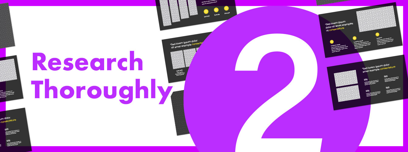
Research is at the core of a successful portfolio!
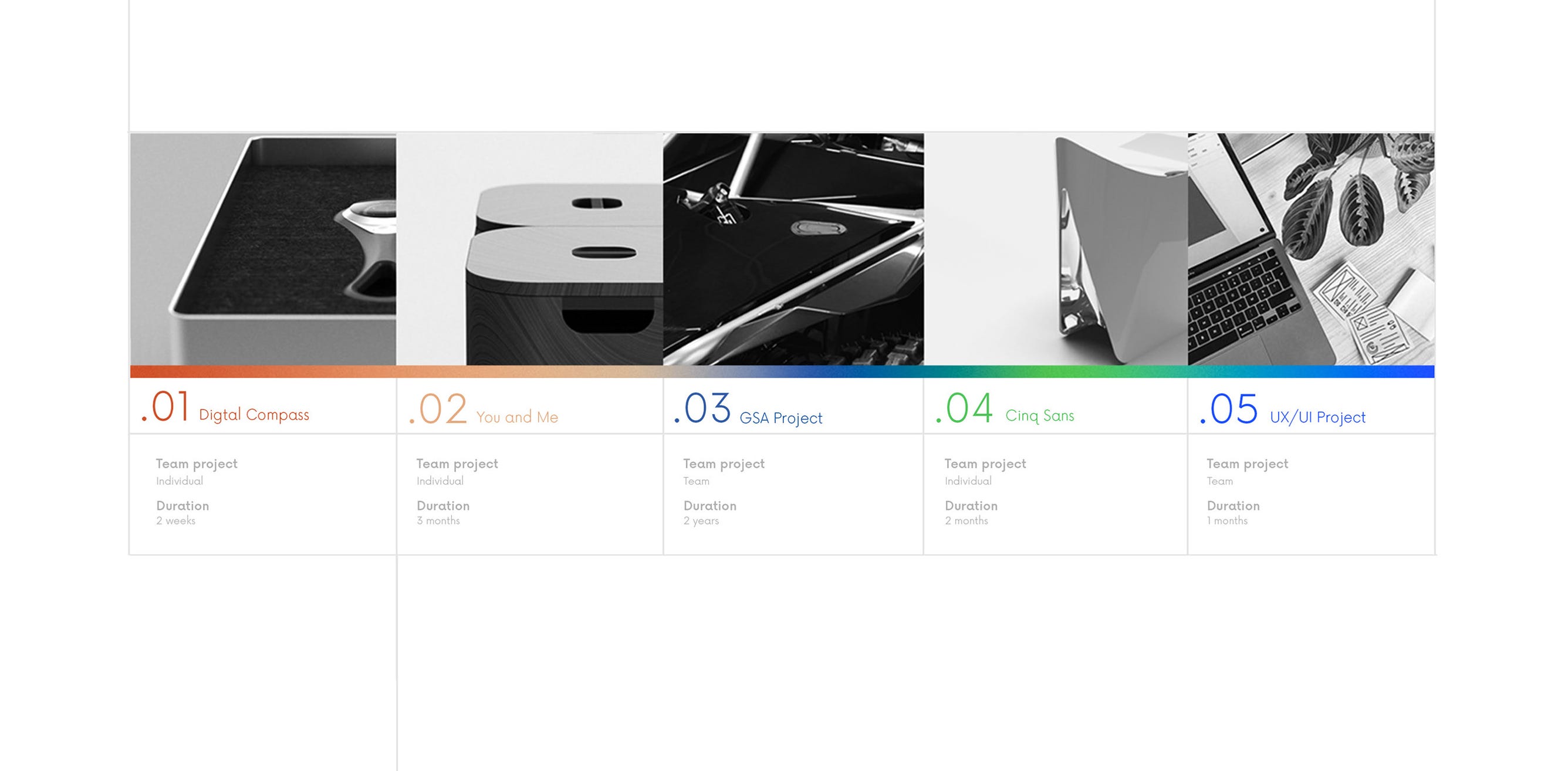
I suggest researching at least 50 creative portfolios in your industry. If you are a UX/UI designer then research at least 50 UX/UI portfolios and study their structures, styling, format and case studies.
Where do you go to find portfolio examples to study in my industry?
Awwwards.com My personal favorite “go to” for web design ideas. Simply type in Design portfolio in the search bar to reveal loads of inspiration. This website is more focused on website layout projects unlike a few of the others listed below.
Dribbble.com If you search portfolio in the search bar you are met with hundreds of beautiful portfolio layouts and designs. Note: You do need to sign up for a free account to be able to view work here.
Behance.com Type in “Portfolio Website” here as well. You can also type in “PDF portfolio” if you are interested in a non web based portfolio layout (we will get to that later which one might be a better fit for you).
What do you look for when researching portfolios?
1.) Notice the repetition.
Because you are studying 50 or more portfolios you have a large sample set. You may start to see repetitive themes, layouts and styles. Is there a common place to find contact information? How many case studies do they feature? How much personality do they put on display in their portfolios? Do they feature a headshot?
Because you took the time to study the competition you come away from this feeling more confident in the placement of a lot of your portfolio elements.
Humans love predictably, for the most part.
After a client or recruiter looks at a few hundred design portfolios sometimes people do not like surprises. It is nice to know where to easily find the contact area, an e-mail address and also be able to view work quickly without being overwhelmed.
As creative people we sometimes feel the element of surprise will somehow gives us creative points or credibility with the viewer. It reminds me of a time almost 10 years ago when a designer I know got a job by posting their entire portfolio on social media. They did it in such a way that it impressed a large ad agency and were offered a job. In that case, it worked but in other cases a more reserved approach would have got them the job. Like we said above, know your audience!
2.) Notice the personal branding.
As you study portfolios notice some of the more memorable ones are oozing out personal brand touches. They are not trying too hard to be creative but they are being consistent and professional with the display of their typography, photo cropping or whitespace use.
What makes a personal brand strong? We will be talking about this in more detail later but keep this in mind in the research phase.
3.) How do they display their work?
Once again, research allows you to see repetitive themes and one of the toughest portfolio creation discussions you must make is how to display your work. Some show it on the home page if it is a website or the first page if it is a pdf portfolio, some take time to introduce themselves first with a bio, or photo. Some may give you over 20 different pieces of work to look at while others just show two.
As you move through portfolios notice how you feel when breezing through them.
Are you frustrated with portfolios that have an overwhelming amount of work displayed? What can help you hone in on the work you want to see? Are they giving me enough context for me to understand their projects? These are all questions we are going to ask ourselves as we start to craft ours.
4.) What can I do better?
Notice some “pain points” while you peruse through peoples work. “How on earth do I contact them?”, “Why do they have photography on a UX/UI portfolio?”, “I am finding it hard to read certain text and my eyes are starting to tire” are frequent thoughts I have myself when researching. The pain points of other portfolios can be a guide on what not to do. Make note of frustrating experiences and find solutions to each.
Let’s research a few portfolios for graphic design, shall we?
First I am going to move through a few of the portfolio websites I recommended above. I am specifically seeking portfolios in the graphic design space, since that is the industry I will be targeting. Some portfolios I click on and spend mere seconds, while others I hang around awhile and study all the details. This is a normal part of researching. If you are not immediately attracted to or impressed by a portfolio then make a note of the pinpoints and quickly move on.
We want to find the diamonds in the rough, only the best will do for sourcing our inspiration.
We are going to talk about this more in the next section but at some point we will need to determine if we want to research website based portfolios or pdf based ones. Also, as we research, study which platforms people use to create them. Are they using their own domains? Are they using a third-party platform like Behance.com to host their portfolio? Do they have both?
I decided to start looking on Awwwards.com and because I already know my niche I can get really specific about how I search for inspiration.
“Graphic design portfolios”
“Creative design portfolios”
“Logo Design case studies”
The first one that I took notice of was not exactly graphic design specific and focused on a UX/UI designer who used to work for Pinterest. Scrolling through one of her case studies for a UX/UI project she throughly defined the problem and goals and thoughtfully presented her entire process using simple and stunning graphs, charts and descriptors. This is a masterclass in proper UX/UI case study presentations.
Although not directly related to type of projects I may present as a brand designer in the graphic design space, I am taking note of this. It might be interesting to take note of the balance of descriptions, text, imagery and charts when presenting my brand design case studies. I come away impressed after reading such detail.
Continuing to search on the Awwwards website I come across this beautiful portfolio landing page by Joe Winfield.
He has quite a bit of experience and past clients so being able to show that off in very top image on his homepage looks impressive. I also enjoy the fact that he has very prominent past projects like magazine cover features in the background, while also making sure the text is still readable on top of it.
Impressive header and project layout. Visit the website here
I also see this hamburger menu on the side that pops out for more options but he also features a secondary menu below the main header that allows you to quickly parse through all the different project types he has, all of this without having to click and load another page.
His individual case studies for each project are equally impressive as he makes sure he features a commentary at the beginning that lays out the project goals and solutions.
Check out how he handles individual case studies here
And although I appreciate his quick defining of who his client is, and what he did for them, I felt I wanted to know more.
It would be nice to add additional process showcasing where he adds additional commentary as the viewer scrolls through the many project images. I am taking note of what I like and also what I think could make an already stellar portfolio better. More on case studies later.
Let’s move onto another website.
Let’s see what we can find on Behance.com. When I typed in the search term “Graphic design portfolio website” I came across an interesting phenomenon. Because a lot of designers do not have tons of money to spend, on creating their own domain names and hosting their own websites, another solution has popped up and I think it is quite effective.
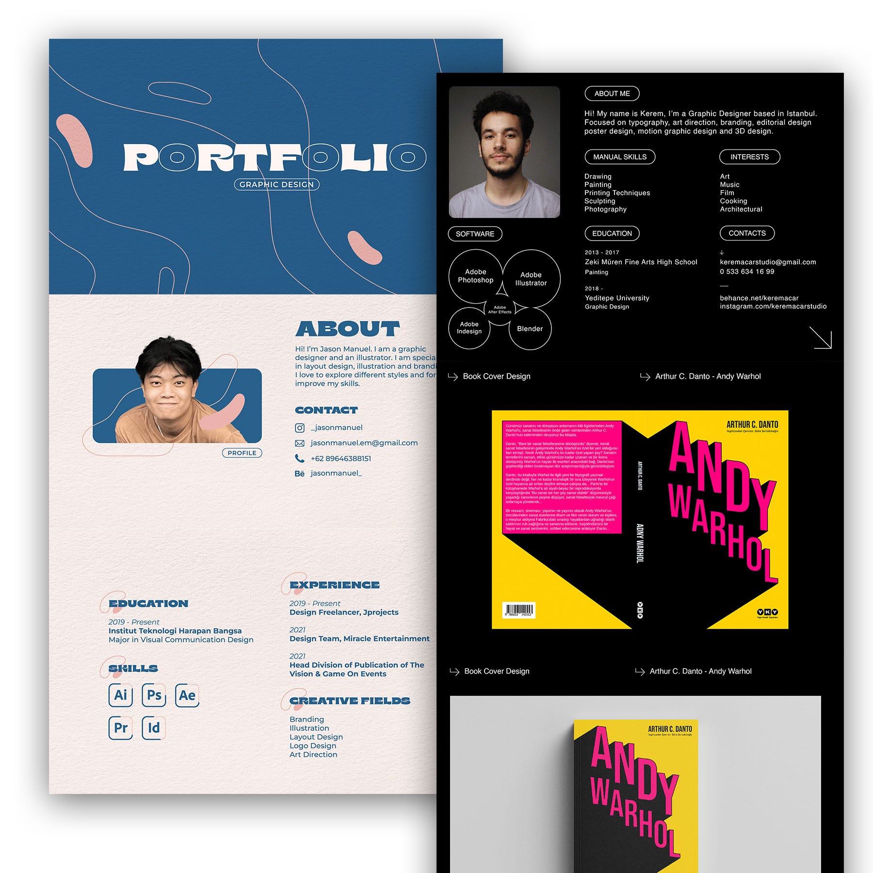
Many creatives have decided to make Behance the place their entire portfolio lives by creating one as a Behance project. Take for example these two projects by Kerem Acar and Jason Manuel.
These portfolios exist entirely on Behance.com.
There is a reason why I put research in front of step 3, which is choosing your platform. That is because we may run across a format that seems more approachable that we would not have thought about until doing the research phase.
I am taking note that in some of these Behance portfolios that exist entirely on a one project page have “some” missed opportunities.
Many do not feature their own website of any kind. Although that is totally fine with a lot of companies or clients, just know that may not sit well with some looking to fill a full-time position. You do take that risk with this approach and it is something to consider, although the majority of recruiters may see this as being innovative or do not mind.
A lot of these portfolios feature a phone number, e-mail or Instagram handle as their favored form of contact, while some do not make it easy to click on a link to contact them, which I think is another missed opportunity.
The way I believe one can remedy these issues is to provide an easy clickable contact option as links at the very start of the portfolio and then again at the end. Once again, we are discovering both the positives and negatives of each project we see and taking note of them (and literally you might need to write these down to review them later, because 50 portfolio reviews is a lot to keep track of).
This next one by Susi Sanchez Arias really caught my eye. It is visually pleasing and she is able to provide pretty much a full CV or resume at the start of her portfolio. Although the layout and typography are top notch, the issue comes down to the readability of her text, in some areas it is just too small and the font weight too thin to make it easy to read.
If you click here to take a look yourself you can see little bits of animation of scrolling text that make it a bit more dynamic than some of the others I have seen. This can be as easy to exporting the graphic as a .gif, as Behance projects supports .gif files.
All throughout she features a similar text and style which makes everything feel unified and cohesive. The additional text explaining the start of each project is welcomed, too.
Lastly for Behance based portfolios, I came across this beauty by Surya Hiperiansyah which highlights how important it is to add some movement to your portfolio. They might have used After Effects, Canva or another tool to create small animations of photos and exported it as a .gif to their project. This allows for motion to be added to an otherwise static presentation.
It might be small detail but the added motion here is something that really feels extra and adds a professional polish.
What better way to study portfolios and case studies than to study the best! I decided to check out the “Discover” tab on the top of the Behance website and I searched graphic design.
I decided to go the main profile pages of the top projects displayed.
Another option I was seeing on Behance were people creating multiple case study projects and using their profile page on Behance as their main website or portfolio link on their resumes and as their main page.
This method could work better than the one long portfolio we talked about above if you have lots of detailed case studies and projects.
Jean Guerreirohas a Behance profile that features some amazing case studies. Each study can have its own style, tone and pacing and it feels like this can give more detail without overwhelming the viewer like the one project portfolios above.
Almost all of the top designers featured on Behance also had their own website.
As much as you may want to avoid the costs of hosting your own website and having to update both a Behance profile, social media and a website, it does tend to be standard to have your own portfolio website at a certain level. This is a discovery only after hours of intense research.
Also, don’t forget to research your local market by Googling for graphic designers (or whatever creative field you are in).
This allows you to see your local competition and ask: what are they doing? How much are they charging? What does their portfolios look like? Websites? After looking at some of the top designers in the world on Behance, Dribbble and Awwwards, you might be underwhelmed by what you see but this is a necessary step in knowing how your locality should affect how you present yourself and your work.
Note: I offer pretty discounted unique Udemy coupons for my courses that give you a big chunk off the price. Link here.
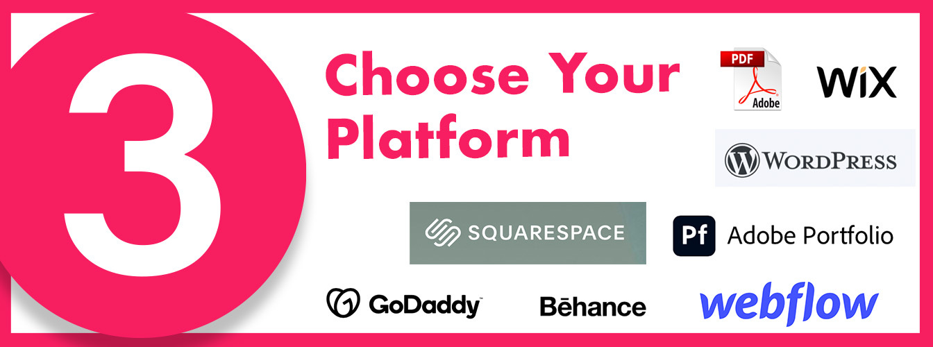
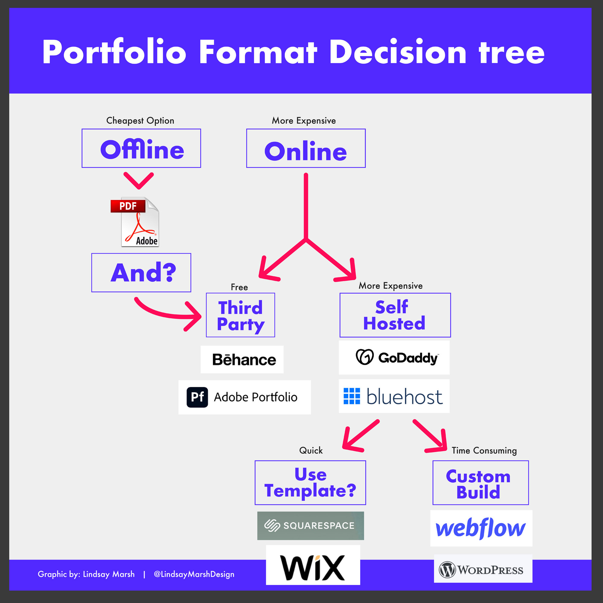
Where do I host my portfolio or in what format?
This is the big question and we need to pick and choose which format we want to present our portfolios in and what platforms or programs we use to put them together.
Let’s first answer the question, “What format should I choose?” This can be tricky because the answer may not just be one format. You may decide to do both a personal portfolio website that you host on a website of your own and also decide to crate a pdf version of your portfolio.
As you can see in the decision tree above, we have some choices to make. Of course these are just companies that I have used for website building and there are many other great options available.
Your first decision: do you even need to make an offline version of your portfolio?
That would mean crafting a pdf version that you can send by e-mail or other means. Five years ago, I might have been more encouraging of creating a pdf version, but I do believe it is becoming more acceptable to apply to positions without one. It used to be required to submit a pdf version of a portfolio to apply to many jobs.
It takes a good amount of work to layout a pdf version as you can see above, but do not write them off completely.
pdfs allow you full control over the display of your portfolio.
They allow you to embed links if you are using InDesign or Adobe Acrobat Pro to edit your pdfs.
pdfs also allow you to display your portfolio consistently across all screens, allowing a uniformed viewing experience unlike websites which can be unpredictable across browser and screen sizes.
pdfs allow you to print and bring in physical documents to an interview which reduces the change of internet connection problems prohibiting the view of your portfolio live.
(We will talk about this a bit later but sometimes it is nice to have different versions of your portfolio available for different niches. A pdf portfolio makes it easier to create and change tailored custom portfolios.)
pdfs may be required to submit to some online job applications
Some hiring managers that are in non-creative fields may feel more comfortable with more traditional portfolio formats
Some creative fields just cannot support them as they do more interaction, motion and video embedding.
It is a tough call and is an individual decision to make. Normally I would encourage every student of mine to create one, but my mind is slowly being changed by industry changes and more accessibility of third party website tools like Behance and web builders like Webflow.
I was so 50/50 on the issue, even as an industry expert, that I decided I had to move outside my headache and into the thoughts of other designers. I decided to ask my community of designers what their thoughts were on the pdf portfolio, was it dead? Here are some of their responses, and once again I continued to notice a 50/50 divide amount the wider audience too. Some of this had to do with generational divides between technology acceptance and use, but going deep into that would open up a can of worms ,so just leaving it here.
All of the comments (including names and profile pictures) shown here were on public posts and permission was granted for those on private posts.
Whatever the decision, if you do create a pdf portfolio, you are going to need to have an online presence somewhere.
That leads to the next decision...
Should I host a portfolio on my own website with my own domain name or host it on a third party website which I do not own?
Third party websites now offer a lot of portfolio building opportunities. For example some of the Behance profiles and case studies you can create can look truly custom and unique. You can create a Behance profile for free, so there is zero cost involved in creating a portfolio on a third-party website.
If you are an Adobe Creative Cloud subscriber you have free access to their Adobe portfolio website where you can create a fully functional website. It does not have all the bells and whistles of a fully custom hosted website, but it does offer powerful templates which make it easy on those who may not want to go all in on learning web design just for our portfolios (unless we are a web designer by trade in which a full custom self-hosted website is a must).
The Adobe portfolio website also allows you to buy a domain name (highly suggested) so you can send people to a real website URL of your choice (instead of www.yourname.myportfolio.com).
What exactly is a self hosted website? How is it better than a third party website?
With third party websites, you do not truly control your portfolio, another company does. If you have a portfolio on Dribbble.com they can decide to remove it or take it down because you are hosting on their property. With having a website on your own hosted platform you own and control 100 percent of the content of that website.
And this now gives us another decision to make if you decide to go the self-hosted route. There are two types of self-hosted websites, one with template builders like Wordpress and Squarespace, and then there are websites that allow for total customization of the portfolio experience, like Webflow and Wordpress.
The decision here is easy if you lack web building experience or you feel like it is a little overwhelming of a process to learn right now.
If this is you, I would stick with the platforms that already feature strong layouts for portfolios. While it is not the only one, I do recommend Squarespace.
These platforms are visual web builders that require zero coding experience. Of course, the downside is if you really want to think outside of the box with interactivity with your portfolio you are out of luck in some cases.
What if I want something completely custom built?
There are times when a truly customized portfolio website is necessary. I recommend this route for those in digital fields like web design, interaction design and UX/UI design as you can showcase your custom web skills on your own turf. Webflow is a great platform to create fully custom layouts as it gives you back-end access to tweaking the code but mostly it is a visual based editor, friendly for those who may not even know a line of code, yet advanced enough.
This example of a nice parallax custom portfolio by Bence is a great example of someone showing off animation and custom web work. They had a custom mouse hover icon and they had a repeating theme of the boxes that was consistent throughout. They are a Webflow developer, so obviously using Webflow to show off custom animation and a continual scrolling parallax makes a lot sense here.
How do you show off your personal style and brand in your portfolio?
First off, I hope you have developed a personal brand for yourself as a creative. That is a big task and includes many steps like developing a logo, color palette, writing a personal bio, symbols and icons to accompany your portfolio, developing a typography system, etc.
There is just no way I can cover all this in one article and that is ok. There will be future opportunities to talk more about the topic of personal branding.
I have the Freelance Masterclass where we walk through creating a personal bio, a pdf portfolio and establishing your personal brand. What I will cover here in this article is how can we take a personal brand and present that in your portfolio.
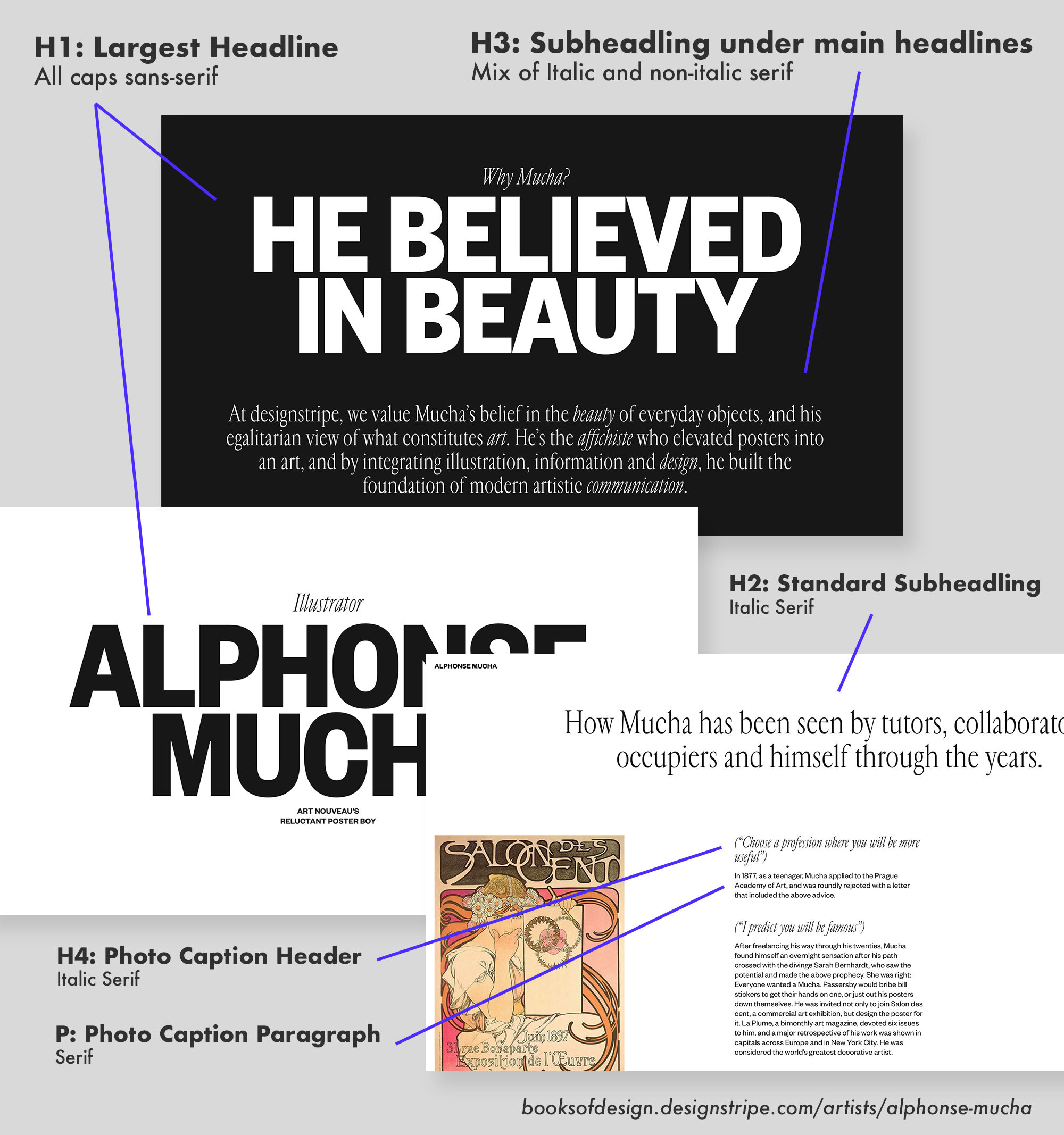
Establish a typography system.
If you already have this developed, great. You already know which fonts to use. Some web builders may limit you on which fonts you can use, though, so there could be added challenges here (this is less of an issue with a pdf based portfolio). The most important thing is to establish what will be your headline type and what will be your body copy size throughout. This needs to remain consistent on every page.
H1: This is the perfect size for the top of my home page as an introduction
H2: This is the perfect size for the case study titles
H2: This is the perfect size headlines in various subsections of my case studies
H3: This is the perfect size for quotes
P: This is the perfect size for the body copy
I am going to be featuring some portfolios that have established some really strong type systems below.
Consistency throughout.
This is a great example of a strong established type system for this design education presentation website called Books Of Design.
You can see as you scroll throughout the parallax single page layout it pairs a sans-serif typeface and a serif typeface. The main opening headline is the largest using the sans-serif with tight leading and tracking. It is followed by a much smaller serif typeface below which gives it a nice contrast. Further down it establishes another headline size (which uses the serif typeface instead of the overpowering sans-serif one) for page headlines further down the page. This website also establishes a different size body copy for captions on photos compared to regular paragraph type.
Formulating a type system gives you a plan to remain consistent throughout your portfolio.
This will give your portfolio a professional and tailored look. Portfolios tend to feature a lot of different elements, like various case studies, bios, opening headlines and having a way to establish a visual hierarchy is paramount.
Imagine if I just used one size body copy for this entire article? It would give you reader’s fatigue and it would not give you perspective on a few headlines and sentences I find more valuable than others.
Choose your colors.
If you have already worked on your personal brand you should already have some basic colors established. But how do we express that color palette in safe ways on our portfolio to make sure we have a fine balance between attention grabbing and being practical?
You may have already established a super saturated vibrant color palette but if you only use these colors on your website you may be dead in the water.
You can use the darker blue as the main portfolio background color. The issue now is you only have one other color that has enough contrast to show up on blue and that is yellow. Yellow on blue can tire the eyes when trying to view other work.
If you choose bright saturated colors for your personal brand because you tend to use that a lot in your work, showing both your work and your bright, vibrant color palette on your portfolio at the same time could distract from your work. You would literally be competing against yourself.
That is why it might be safe to use your Signature colors more subtly on a portfolio, allowing small peeks at your personal style. You can use some neutral colors in the background to balance out your palette and put your best work forward.
Think about how a gallery displays artwork. Usually it is stark white, black or gray walls. This allows the artwork to be the main focal point of the wall, not the paint color.
You can also display your color palette through typography, small animated icons or gifs and also stylized lines and divider bars.
In this example below, in the chapter titles, Pratik Deshmukh ads pops of color in the right side which allows for personality and vibrancy without distraction from the work below.
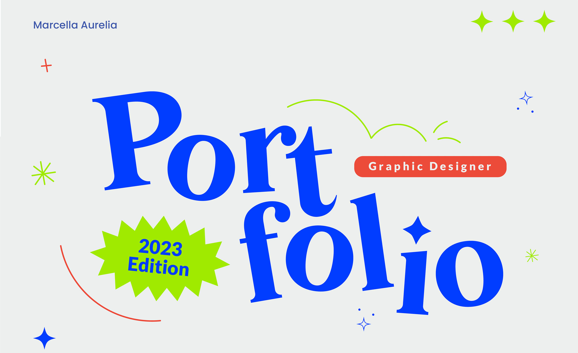
This portfolio header by Marcella Aurelia adds several contrasting saturated colors without overwhelming the area.
Showing off your personality.
How much personality is required for a good portfolio? That is a total subjective question and of course, once again, depends on what type of work you are looking for and what industry you are in.
When looking for a creative professional I am looking for both competency and a specific STYLE.
Competency is easier to show off by displaying your project work, but most people looking to find a creative talent are looking for a specific style of work. While some designers have high competency, their overall style might not fit with the company that is hiring.
Here lies the complexities. Designers do not have just one style. Some of us feel more comfortable in a specific style, but for paid work, we can expand our talents to just about any style. We need to balance showing off our style without making it seem like that is the only style we can do. Like always, there are exceptions to this rule, like a freelancer who has already established themselves in a specific style or only wants to do that style. They earned the badge, so to speak, and can afford to commit to one style completely.
Various graphics used throughout are consistent in style yet do not overwhelm the entire portfolio. View here
The majority of us though will need to strike that proper balance. Like I talked about with color above, we can make more subtle gestures in our portfolio headers, typography and use of layout to display our personal style without going so far toward one style preference.
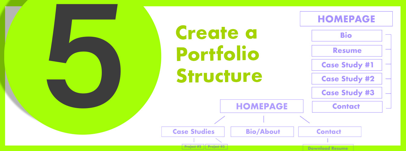
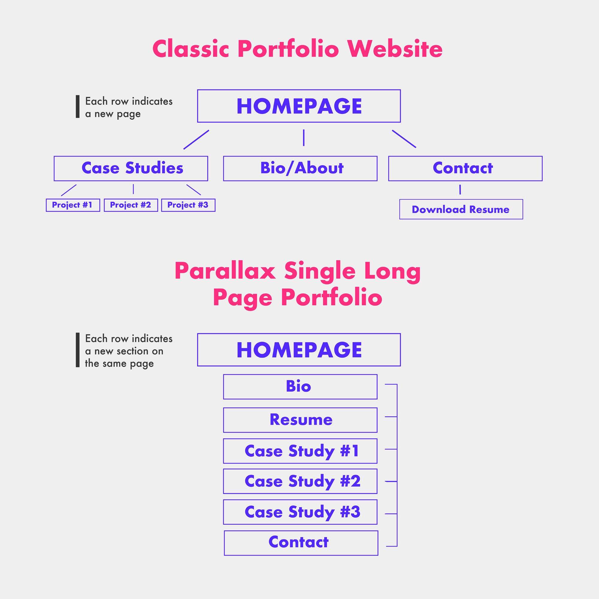
Establish a site structure.
Is your portfolio going to exist on one long scrolling page? Will your case studies be features on its own page? Will your contact info have its own page? Sketch out a site map (site structure) so you can know how much room or space you have for photos and information. I like using Figma, Adobe Xd or another UX/UI wire framing tool to help me come up with a site plan, but it can be as simple as sketching it out on paper.
What should I include on my portfolio?
This is part of the process of creating a site structure or, in the case of creating a pdf portfolio, a part of figuring out not just what will be in my portfolio but where will it be located and how will users find it. For a classic website layout, for example, the user may be presented with a homepage with a short phrase or quote and then given the chance to click on a separate case studies link to view work.
It could also be that the case studies, contact info and bio are presented on the homepage in a long scrolling parallax style website. Or another option is that the pdf portfolio layout will start off with a short introduction and then lead right into the first case study with the bio existing between case studies. There are lots of options! None are wrong or right, as each situation is different, but having a plan helps.
Figuring out what is most important in my site structure.
Remember that site structure is the very basic items you want to have on your portfolio. We will worry about the layout next. Ask yourself the following questions to determine what goes first and if you need to include it:
1.) Do I want a starting statement?
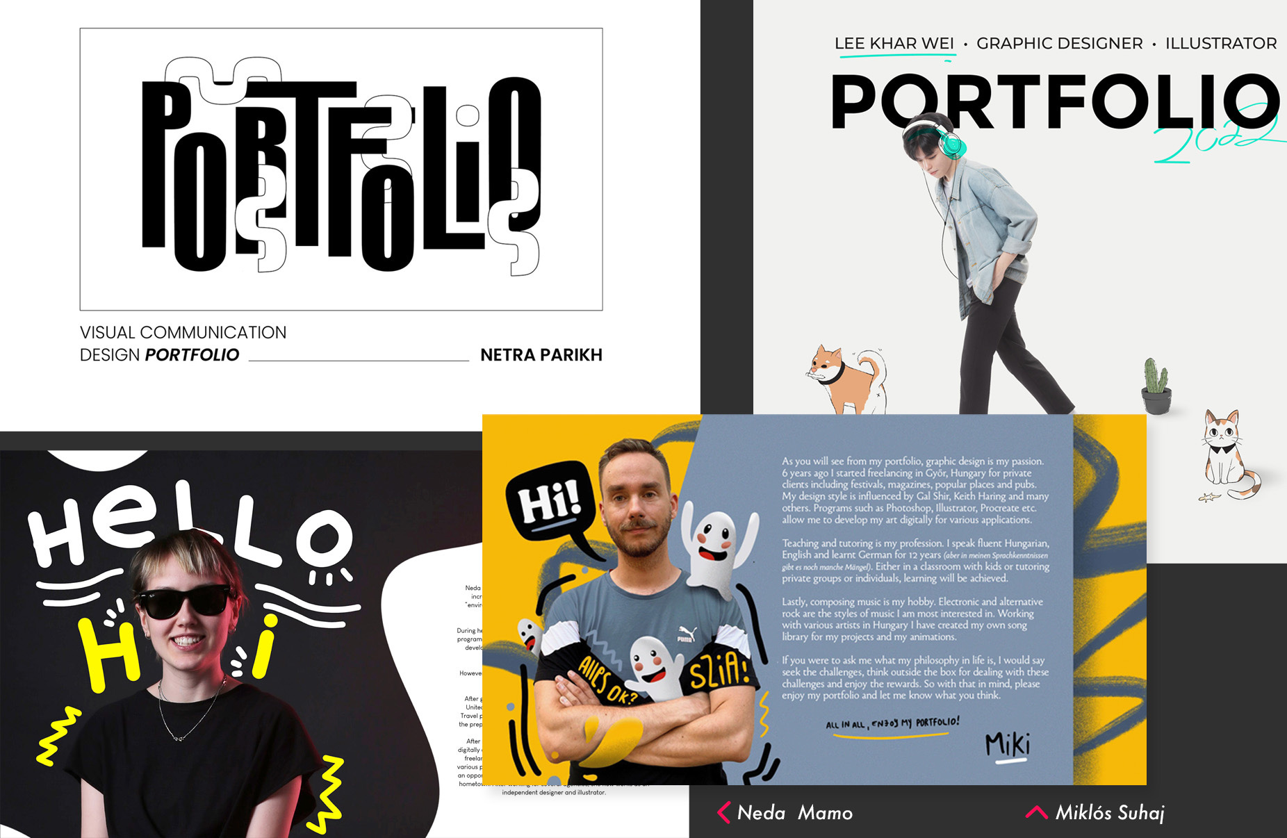
This can be a mission statement if you are a freelancer or a statement that defines your unique characteristics if you are applying for a job. This usually is included on your home or welcome page and starts of the learning journey for your viewer. I have seen it used very effectively, as opposed to a simple welcome message that says “my portfolio”. Here are some examples below that I thought worked very well:
Daniel Gamble’s portfolio above features some really engaging scrolling features. When I go to the process page it had a nice clean simple statement. What made this one intersting is every few seconds the word after “Daniel Gamble is…” statement it would shift from “creative”, “designer” and “strategist”. It was a clever way to shorten his statement.
Hannah Lipking’s portfolio starting statement is short and to the point. It features her heavy illustrative style which takes the place of a long statement.
Just a few scrolls down the page she goes into a bit more detail with another simple once sentence summary statement and a more detailed paragraph to the right about her abilities and current situation. This is brilliantly done and makes everything simple to digest.
Another Clean example by Daniel Vaszka has a headline statement with two smaller statements that lead the viewer to a call to action. Statements do not have to be long and you do not have to tell your entire story in the first portion of your website. Some do it slowly while talking about projects, work and experience. Avoid “front loading” too much info at first.
Milkink Creative studio has a bit of a longer starting statement than usual. The viewer is greeted by a visual treat with the company name at the very top and this is the next page as you scroll down. I am putting this here because of how well written this statement is. They are raw and authentic in their writing style which reflects their brand. They remain professional throughout and clearly identify several things:
1.) Stated who they are. 2.) Showed where they are based (not required but nice). 3.) Defined their uniqueness. 4.) Talked about awards and accolades. 5.) Have a strong closing sentence which advances their unique qualities.
Some with more experience may put some accolades, awards, total clients served or years of experience in the industry to really try to “wow” people at first glance.
2.) Do you include your resume or CV on your portfolio? Well, it depends.
When doing my research I found this was done quite often. There are some great opportunities to show off your layout design skills by displaying your resume on your portfolio, but it may not always be required. There can be a lot of personal information on these resumes and, if you are afraid of having that available publicly on a website, then having a separate pdf version of your resume might be best.
If you are applying to full-time jobs and your portfolio website or pdf portfolio is the main method you are providing, then including a resume on your portfolio can be more helpful.
For client or freelance portfolios, having a resume might be beneficial. Most clients want to see your work and are less interested in the college you intended. Freelancing based portfolios should focus more on the case studies, your process and your unique qualities.
3.) Where do I put my project work?
For project work I like to recommend a case study style of display. This allows you to talk about your creative process and show photos along the way in a narrative driven format (more about that later). We need to figure out where to put our project case studies on our site map. Some decided to show it quickly after a welcome message.
Straight and right to the point can be effective for those who have to look at hundreds of portfolios a day and are glad someone is showing their work quickly without having to jump through hoops or overly designed experiences.
The other side of the coin are those looking for how you designed the experience. An interactive or motion designer will want to slow the process of getting to the work as the experience to get there is the work itself.
3.) Should I show my process?
Showing your process could be helpful if you are offering creative services as a freelancer on your portfolio. You can show your process in two ways:
A.) Show your process while presenting your projects/work. This can have benefits in that you are both presenting work and demonstrating your process. This will work best for those applying for full-time work or for those freelancing.
B.) Having a separate “my process” page or section of your website that details each step. This provides clarity for those who may wonder what is next if they do decide to go further. Dima Kurlow’s website has a dedicated “How I work” page that details his workflow and process. This works great for freelancers who have complicated offerings like web design and branding work.
4.) Do I have a contact page?
Ending your portfolio with a contact page/area is expected, while some put the contact info in a separate dedicated page on a their portfolio website. If you are doing an online portfolio always make an interactive clickable link to an e-mail address or phone number. Those wanting to be more private can provide a contact form.
Providing social media handles is helpful only if it is a 100 percent extension of your professional voice. Meaning, if your social media is even 10 percent personal it is best to not include it.
Create a portfolio layout.
If the site structure is the basic map of all content on the website the layout will determine exactly where it will be displayed on any given page.
This portfolio layout plan by Julia Havryliuk allows her to easily plan the type of content she needs to gather and work on to complete her plan. What you are seeing is a lo-fi or low fidelity wireframe. This does not include photos or details *yet and allows you to see the big picture and easily make layout changes before finalizing.
I have seen some insanely creative portfolio layouts. This one by Diana Lu, an interaction designer, decided to break the predictable mold of vertical portfolios to make hers entirely horizontal. I also like the easy access to her resume and works on the upper right side of the site. I do not have to hunt for that much needed info.
We will next go over the case study, how many to include and how to construct them.
No previous work? No problem!
Not all freelance graphic designers, or those who just graduated from design school, have large previous work to display in their portfolios or resume — especially when they are first starting out. I enjoy seeing at least one personal project in a portfolio because personal work tends to better demonstrate passions and talents more than client work.
If you feel your portfolio needs some fresh new content, look at the various websites that offer design challenges. These daily design challenges can not only sharpen your skills but help you expand your portfolio. If brand design is your thing, I recently wrote an article on substack that features 5 hyper-detailed client project briefs that will make for great detailed case studies for your portfolio. You can access those 5 briefs here below.
Will “fake” client briefs be okay to use for my portfolio case studies?
The goal of your portfolio is to demonstrate your ability to complete projects and exceed goals. If you never had a paying project before or a previous job to show off that is okay. I do believe it is professional to make sure we declare which projects are based on real companies and which ones are not. You can put a very small disclaimer at the bottom of any case study that it was based on a fictitious company that may go something like this, (by the way, feel free to steal this!):
”This case study was derived from a fictitious entity and was created for educational purposes only to display my talents and creative skillsets. Any affiliation or likeness to an actual entity is purely coincidental.”
As time goes on, you will be able to slowly replace those fictitious projects with real-world projects.
Is it ever possible to show too much work?
You may have a detailed work history or tons of great personal projects that can fill up 100 pages, but that does not mean you should display every single one. Strong graphic design portfolios feature a few projects (typically your best work) and present them well with beautifully crafted images and descriptions that are neither too vague nor too long.
Limit your portfolio to 3-6 case studies or projects.
The difference between showing a case study as opposed to just showing your projects is found in the explanations. Case studies can reveal your unique workflow and let the viewer get a glimpse of how you think and approach projects. You can demonstrate the brainstorming process of a logo design, perhaps raw sketches and concepts of a package design. This leads the viewer on a journey that informs them about you as a designer more than a series of still photos ever could.
Rarely do I recommend showing just a picture of your work without any details or demonstrating your workflow. Yes, it takes a lot of time to put together a case study, but I find them much better “sales people” on your portfolio.
You want to answer the question “If I hire this designer, what will my experience be like?” and “Will they be a good fit for our organization?”
A lot of designers are underselling their creative process.
There is a huge lack of explanation of the creative processes and steps a creative goes through when creating their projects.
A project that might have taken you three weeks is summed up in a few sentences at the top of a presentation, and I think that is unfortunate.
There is a huge opportunity in explaining more of your creative process and the details so the viewer can get to know you as a creative person. There is a balance between too much talking and not enough and we need to test our case study out among others to find that perfect balance.
After reviewing thousands and thousands of portfolios, the creative process is what I found was lacking the most. In some cases a stunning project was “passed by” as just another pretty looking project while some technical explanation of the process could have drawn me in more.
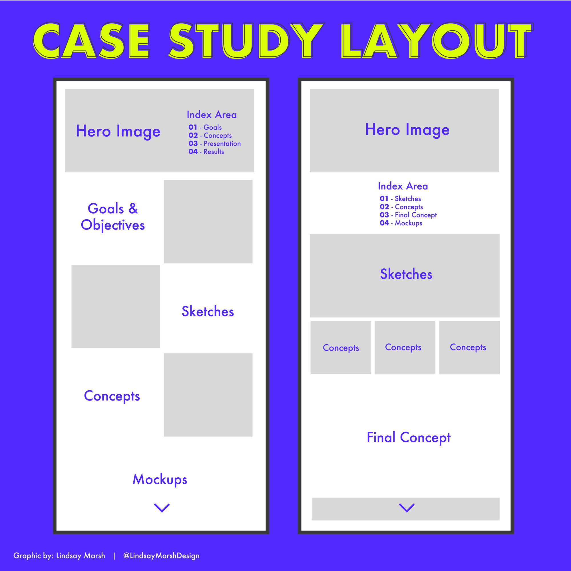
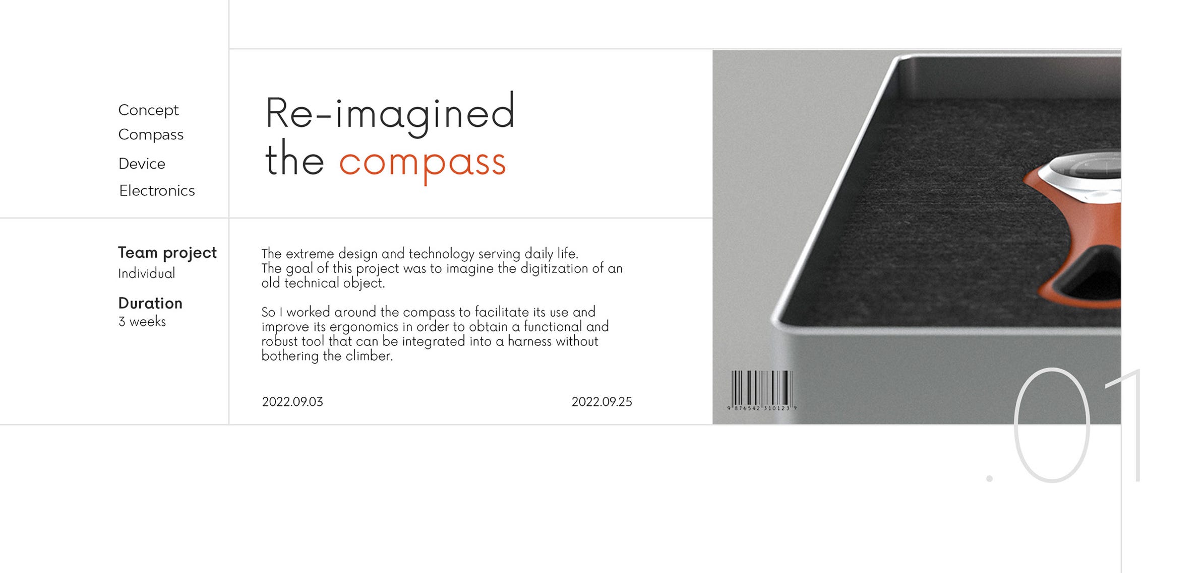
The basic anatomy of a strong case study.
There are many different ways to layout and display a case study and a lot of it depends on your industry. A UX/UI designer will feature much more text describing the user flow and user journeys of their client projects. A logo designer case study may feature more photos of early logo concepts and talk about their process in coming up with the final chosen design. An illustrator may show a moldboard of installation for a character design.
The variety of case study layouts are endless and not every case study may need the same layout and amount of text vs. photos.
The good news is once you strike that proper balance between imagery and written text your case study layout will fall right into place.
Just like we said before, we need to create a plan of how our case study will be displayed. Ask yourself “Which images do I need to create to properly display my process?”
1.) Write story-driven narratives that solve problems.
Try using a story-driven narrative for your case study descriptions. This approach adds more depth to your words and is more like a one-on-one conversation rather than a pitch.
Actionable Tip: Do not try to sell yourself too hard. Try to avoid cliché and common phrases in your headlines or text. You want to create unique project headlines that are custom to you and echo your unique approach to your craft or services. Write project descriptions that focus more on identifying the problem and how you worked it through rather than a list of tasks you completed. For example:
Typical portfolio language: I created a brand project for XYZ company that consisted of a logo refresh and new branded materials and brand assets.
Story-driven narrative: XYZ company approached me with a problem. They were concerned their old brand was tired and needed to reinvent themselves to stay relevant with their shifting target audience. I discovered in my research phase that XYZ company had a large audience of young mothers, so we redirected the rebranding efforts to soften the brand’s visual appeal and add a more illustrative vibe with calm neutral color hues. This research helped to create a visual system that more closely related to XYZ’s demographic in new and dynamic ways.
2.) Find ways to distribute photos and imagery throughout to give it the feel of a magazine article.
Now that you have your process written out, find opportunities for visuals. In some cases this may mean creating custom graphics that display your entire process in a type of order or show off some of your early conceptual phases. This step will take the longest as you may not already have the perfect visual for the process you written up. See below for a fantastic well balanced case UX/UI case study that uses a wide array of custom branded graphics throughout.
They further break down the logo mark and symbol using a branded graphic and keywords.
And speaking of story telling narratives, this case study example below of a personal brand design is worth the read through. It starts off discussing the start of project with a conversation and an idea. It further details every step in their brainstorming process. This type of case study display helps to really review your entire design process while presenting real work. You can do this in a way that keeps the viewer engaged and interested without becoming overwhelmed.
3.) Have an index page or guide if you have multiple case studies.
This is the perfect example of a providing a helpful index that organizes the case studies in this portfolio. They do so in a color-coded manner with a preview image that highlights each case study. It lists the duration of the project and what type of project it is. As you continue to scroll down you are presented with each project with a story and a setting up of the problem. Later in the case study you find a solution well laid out with custom graphics, charts and text.
Instead of an index style area where you showcase all of the projects at once, you can have headers that slowly introduce your work like this example. This works best for those with more simple projects with less lengthy case studies. One thing to keep in mind is to always introduce each case study.
But what if my work does not have much of a process?
There is always a creative process to anything type of creative work. Are you an illustrator? You can show sketches of your character design and show how it evolved over time. Are you a surface pattern designer? You can show other iterations of the pattern on various mock-ups and show how you took client feedback to develop the final chosen pattern.
If you made it down here you may be have a touch of reading exhaustion by now! We can only read and take in so much information before we need a break. So if you need one go grab a quick snack!
The same will go for your case studies. It is great to mix it up with animation, video and other exciting visual treats to help break up that reader fatigue.
Also, make sure to test your portfolio out with others to see if the length and pacing is just right. There may be some text and imagery that can afford to be cut if needed.
4.) Create a theme.
Strong case studies have powerful thematic presentations. This portfolio by Danco uses a similar theme to present different projects throughout her portfolio. The same can go for a single project presentation. Each image was thoughtfully crafted and integrated with similar mockup sizes, photos, background color and illustrations.
What about everything beyond showing your work?
There is a lot more to portfolio building than what we have discussed so far. Do we include a bio? If so, where? What type of contact info do I need to include? Should I include a photo of myself anywhere? Hopefully, we can answer all those questions in this final segment.
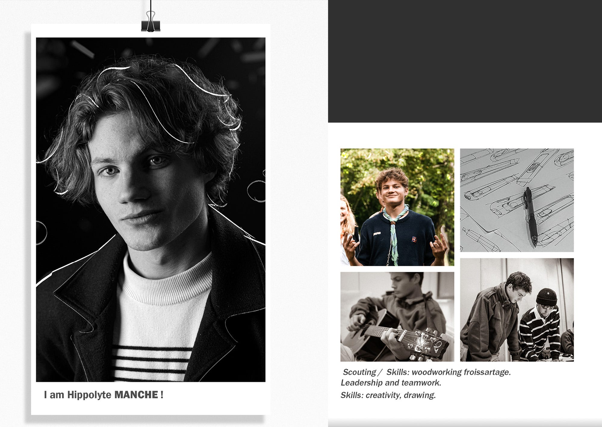
How to write a well crafted bio.
Are full page, long bios required? No, not always. Sometimes the most effective bios are shorter summaries that really capture you as a creative in a short and concise manner.
We talked about starting statements a bit earlier and sometimes that may all be that is required. Below is a fine example by Elena which keeps it sweet and simple. This may be fine if you also decide to have more lengthy case studies in which you are able to further describe your style and abilities in more detail.
If you are applying to full-time job opportunities or pitching for longer term freelance contracts it might be helpful to provide a slightly longer bio in a separate bio page.
Some tips when writing a more lengthy formal bio.
Showcase your unique story: Your bio is an opportunity to tell your story and highlight what makes you unique as a creative. Share relevant details about your background, experiences, and inspirations that have shaped your artistic journey. Emphasize the aspects that differentiate you from others in your field and make you stand out.
Highlight your expertise and achievements: Outline your professional experience and achievements in a clear and concise manner. Include any relevant educational background, notable projects you have worked on, awards you have received, or recognition you have gained. Focus on the accomplishments that are most relevant to your target audience and demonstrate your expertise.
Use a consistent tone and voice: Your bio should reflect your personal brand and the tone of your creative work. Consider whether you want your bio to be formal, informal, or somewhere in between. Align the tone with the type of clients or collaborators you are trying to attract. If you specialize in a particular niche, infuse your bio with the appropriate language and terminology that resonate with that audience.
Keep it concise and scannable: While it's essential to provide relevant information, remember that brevity is key. Aim for a bio that is around 150 to 200 words or shorter, if possible. Use bullet points or subheadings to break up the text and make it easier to read and scan. People tend to skim through bios, so make sure the most important details are easily identifiable.
Inject personality and authenticity: Don't be afraid to inject your personality into your bio! Showcasing your unique voice and personal style can help you connect with your audience on a deeper level. Be authentic and avoid generic statements that could apply to any creative professional. Share your passions, values, and what drives you creatively.
Include relevant contact information: Make it easy for potential clients or collaborators to get in touch with you. Include your professional email address, website, social media handles, or any other relevant contact information. This allows interested parties to reach out to you directly and explore opportunities for collaboration or commissioning your work.
Remember, your bio is not set in stone. It's a living document that can evolve over time. Regularly revisit and update your bio as your creative journey progresses, and as you achieve new milestones or embark on different projects.
Should I show a photo of myself?
Portfolio photos are two edged swords. On one hand, how we look can tell a lot about a person, which can sometimes makes us feel connected to someone knowing what they look like.
On the other hand, we can make a lot of assumptions on their performance, education level, background and personality on photos which can impede the ability to hire the right creative.
So, what do I do? I personally think it is beneficial for new graduates or younger creatives without a work history applying to full-time positions to display a photo on their portfolios. This allows a connection with with recruiter who is pouring through hundreds of applicants.
Where I think it not beneficial is with freelancing. The client may not be a part of a human resource team (and does not have training on the matter) and may make judgments based on sex, race, clothing, tattoos, hair and appearance. As a freelancer, I do not think it is important to show your face, unless you are in an industry where that is a part of the job. It is best not to let any type of bias play a part of your freelance relationship with your client.
As a women in the freelance design industry for 20 years I rarely (if ever) have shown my face. I am not ashamed of being a women in a male dominated space, I just never wanted that to play a factor in any decision to reach out to me.
I wanted the full focus to be on my work and not what I look like. Of course everyone will have a different perspective and you need to follow what you feel comfortable with.
As you can see, there are so many differences between creating a freelance portfolio and a job application portfolio.
Adding social proof to your portfolio.
Social proof is fantastic if you have it. I make sure to ask every prior client of mine to write a short testimonial so I can keep a word document full of potential quotes I can use throughout my case studies and on my contact and bio pages.
You can steal my referral request I use for clients so you can start building a library of positive feedback:
Dear Client (insert name here),
I am so glad you enjoyed the overall process and that you are happy with the outcome of our project. I wanted to let you know I am continuing to grow my business further and would appreciate you passing my name along to anyone who may also need design services. Once again, thank you for the opportunity and I look forward to continued collaboration on further projects.
Best Wishes,
Your Name
By strategically placing client testimonials on your portfolio website, you can enhance your credibility, build trust, and provide valuable social proof to potential clients or employers. Consider the layout, design, and overall user experience when incorporating testimonials to ensure they seamlessly integrate into your portfolio website. A few ideas...
Have a Dedicated Testimonials Page: Creating a separate page dedicated to client testimonials is a popular choice for many portfolio websites. This page can serve as a centralized location for all the positive feedback you've received. Organize the testimonials in a visually appealing manner, using a clean and easy-to-read layout. Consider categorizing the testimonials based on specific projects, services, or industries to help visitors find the most relevant feedback.
Homepage Spotlight: Placing a selection of compelling client testimonials on your homepage can be an effective way to grab visitors' attention right away. Consider featuring a rotating carousel or a section that showcases brief snippets of testimonials. Ensure that the testimonials are visually distinct and use eye-catching design elements to make them stand out. Make sure to include a link or button that directs visitors to your full testimonials page for more in-depth feedback.
Project-Specific Placement: If you have specific testimonials that relate to particular projects or collaborations, consider placing them strategically alongside the corresponding project details. This helps to create a stronger connection between the positive feedback and the work you've showcased. By including testimonials within the context of specific projects, you demonstrate the impact you made and the satisfaction of your clients in a more targeted way.
Throughout the Website: Don't limit testimonials to just one page. Incorporate them throughout your portfolio website to maximize their impact. For example, consider placing a few select testimonials alongside your portfolio pieces or in the sidebar or footer of your website. This way, no matter where visitors navigate on your site, they will encounter positive feedback that reinforces your expertise and credibility.
Case Studies or Success Stories: For more detailed testimonials, consider creating case studies or success stories that provide a deeper dive into your work with specific clients. These can be standalone pages or sections on your website where you present a project from start to finish, including the challenges you faced, your creative process, and the outcomes achieved. Within these case studies, you can include testimonials from the clients involved, showcasing their satisfaction with your work.
As you can see there are so many different portfolio formats, layouts and platforms to choose from.
It is just such a massive topic I found it incredibly difficult to tackle everything in this one article. Hopefully in time I can continue to update and add to this article.
This can be such an overwhelming topic, but I hope this article gives you a jumpstart on tackling some of the details of building your creative portfolio!


Feel free to not only ask me questions about portfolio building!
Checking back in. This article has gotten over 10,000 views!
https://open.substack.com/pub/lindsaymarsh/p/the-starter-guide-to-building-the?r=28omcs&utm_campaign=post&utm_medium=web&showWelcomeOnShare=true
Glad everyone has enjoyed the article so far. Let me know additional portfolio related issues you want me to write about next.
As always, check out my website for 80% off course coupons and a 50% off link to my pdf design theory book https://lindsaymarsh.myportfolio.com/